The Bathroom is Done Done

A few weeks ago, I shared our finished bathroom with the promise that I would be back with some pictures of the space with all the accessories and art. So today, I will honor my promise (even though technically, I think I’m a bit late on my delivery) and show all the fun details that make the bathroom feel complete. Drum roll please:
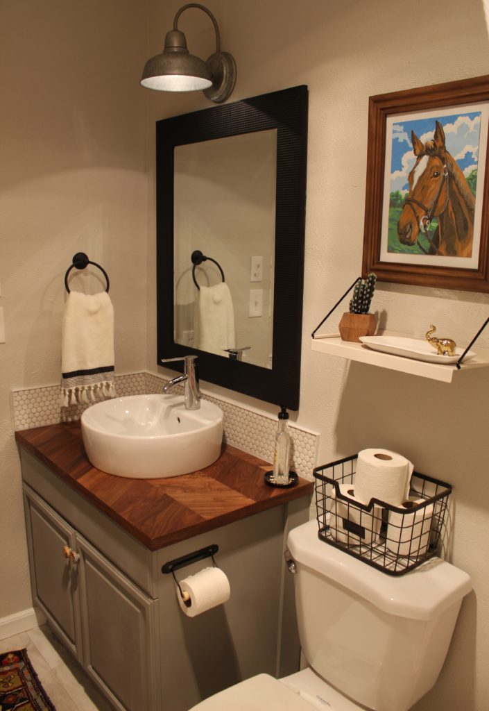
We are very pleased with the finished product. And I use the word finished loosely because it seems like I am never quite done tweaking things. Nate hates that, but I loooove it. Tomato tomahto. I have to say, this was my favorite part of revamping a space…all the little details.

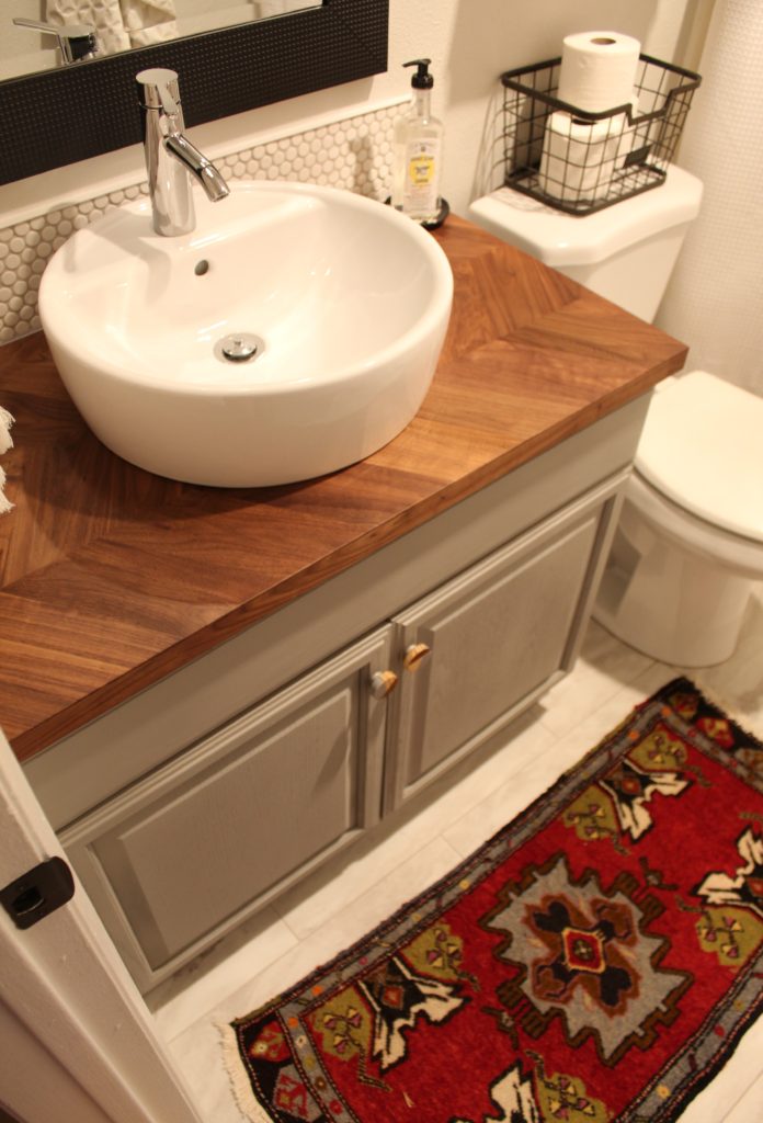
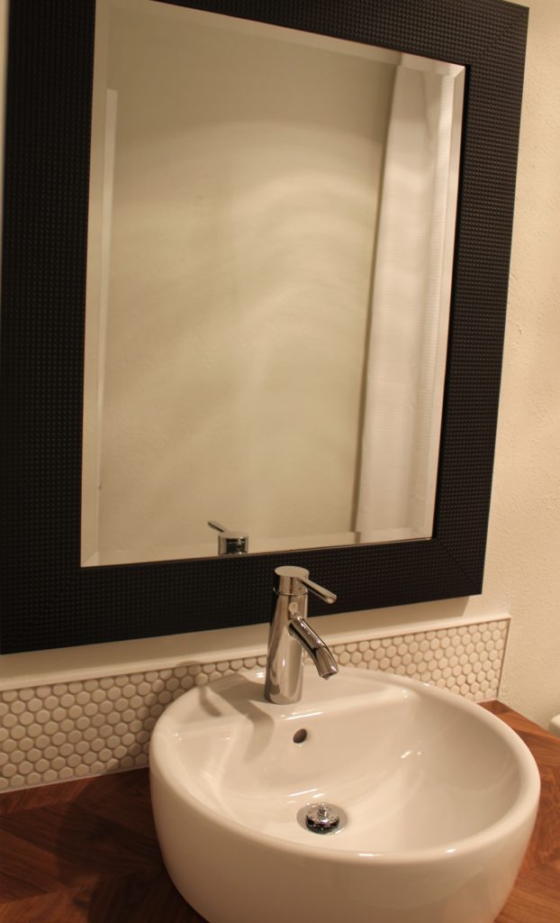
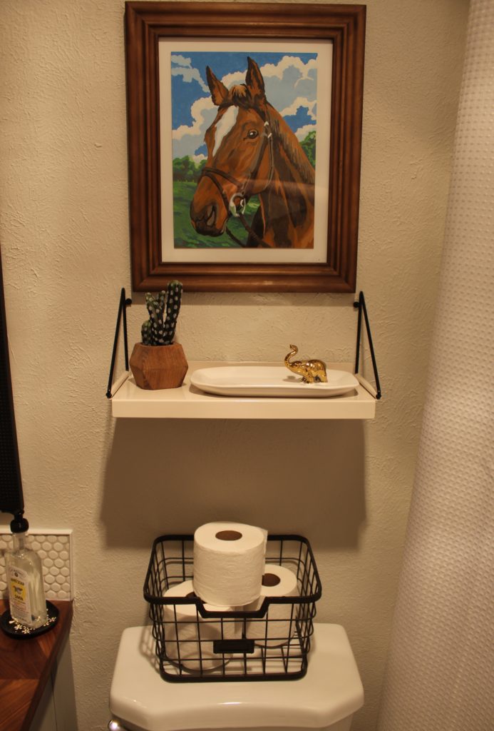
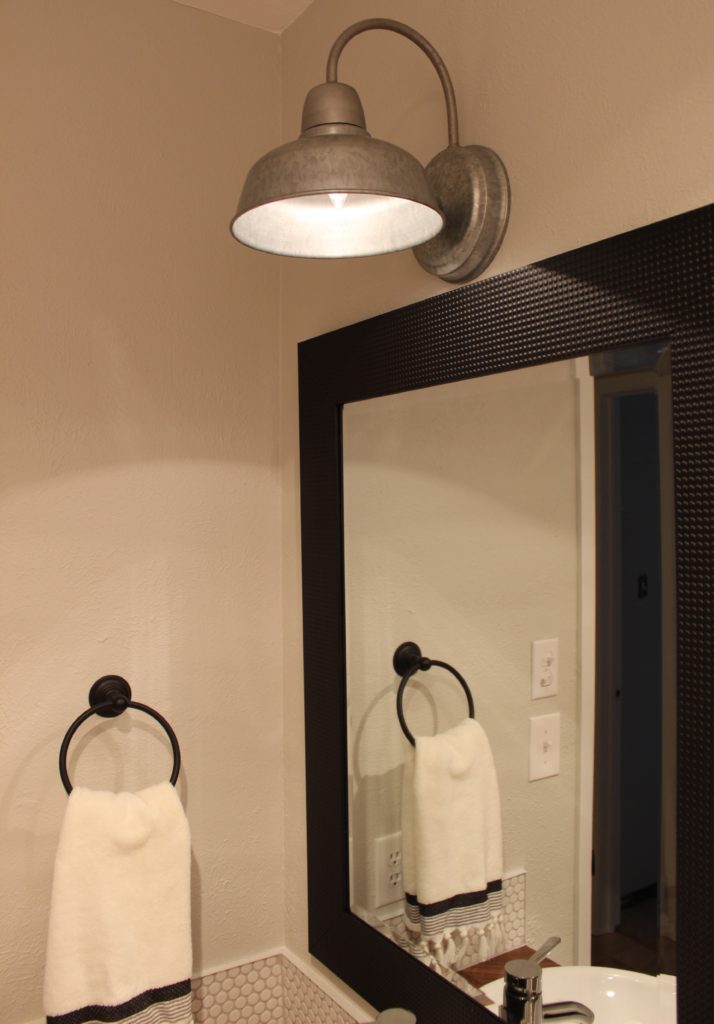
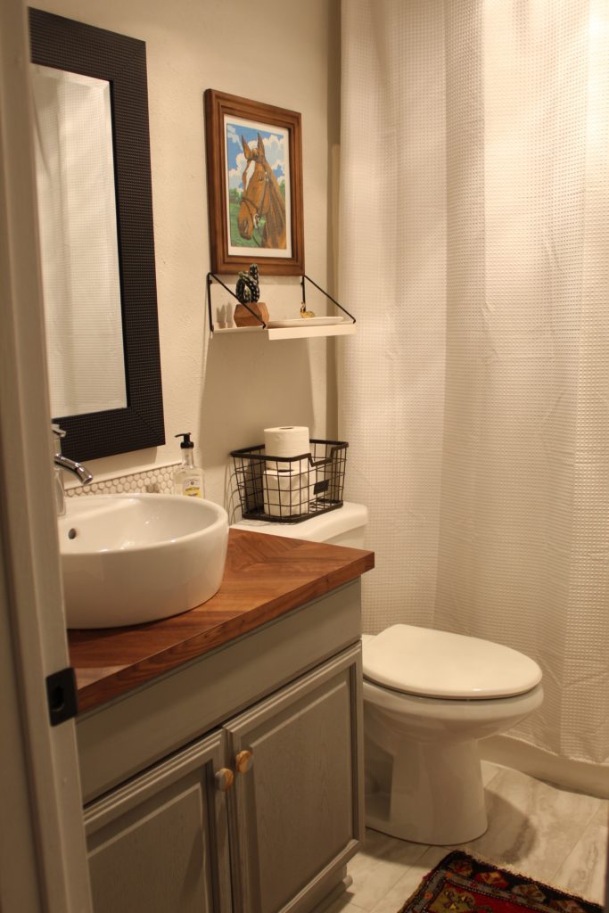
When the mirror was hung, I was nervous it was all wrong. And it would have been an annoying error to make because I had already painted the frame a flat black so there was no turning back and returning to the store. To remedy this, I brought in as many black elements as I could. All of the other pops of black help make the mirror feel less chunky. Now, it feels much more balanced to me and less like “look at this mirror with a giant black frame.” The basket on top of the toilet, the towel hooks, toilet paper holder, and hand towel ring are all black.
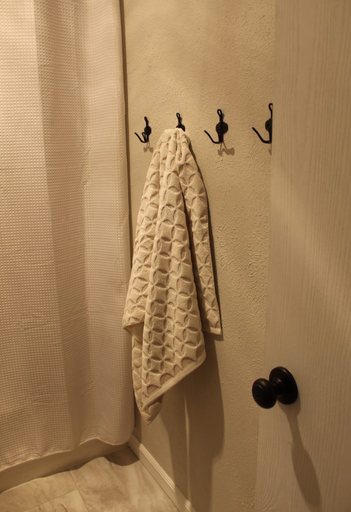
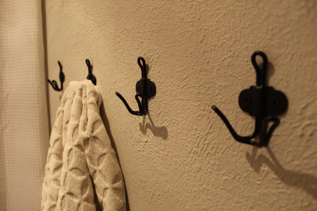
I thought that hooks for towels might be a fun change of pace from the old towel bar. And now that they’re up; our kids can actually hang their towel up on their chosen hook. When the old towel bar lived there, the kids would haphazardly throw their damp towels up on the bar. The messy towels drove me nuts because it looked sloppy and the towels couldn’t easily dry. Nobody likes a damp towel.

We installed a shelf above the toilet which is a nice spot for a few decorative pieces and a tray to wrangle bobby pins and Nolan’s hair barrettes. I had a lot of fun completing my first “paint by numbers” picture and framed it in an inexpensive wood frame from Target. Also, notice the black brackets on the shelf? I thought they complimented the mirror nicely.
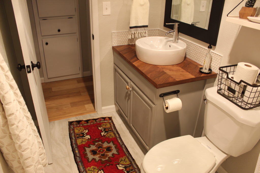
My little vintage rug that we found at Round Top last fall fits perfectly in our little bathroom and I think it makes the room feel special. It’s perfect for a bathroom because it adds some color and pattern. I also like that it’s low profile so the door can open and close over it but it’s heavy enough to not slide around.
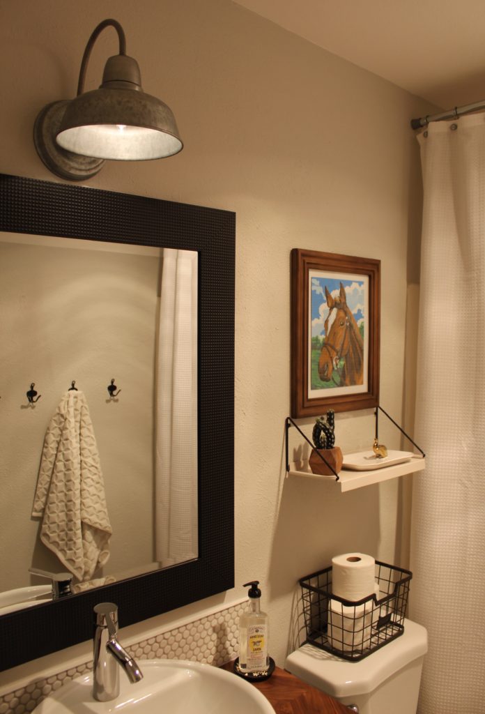
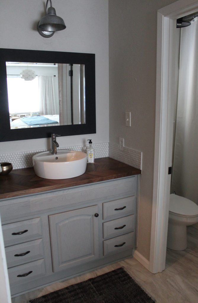
The light above the vanity is a galvanized steel finish and I like its casual feel. It is our preferred light for the bathroom as it casts a soft light directly onto the vanity.
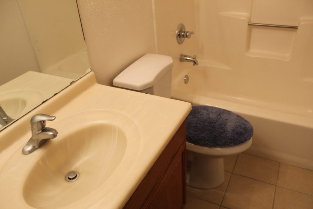
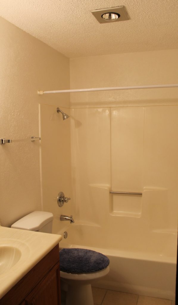
That’s about it for our main bathroom. We can check this off our list and call this one done. One last time, let’s look back at where we started:
And now we look like this:
And speaking of making good progress, our master bathroom is looking a lot like our main bathroom these days. We have two bathrooms in our house and they are located right around the corner from one another. When we started planning to update them, we decided early on that they should have the same look and feel since they are so close. It seemed odd to give them each a completely different design. They aren’t quite twins but maybe they could be sisters?
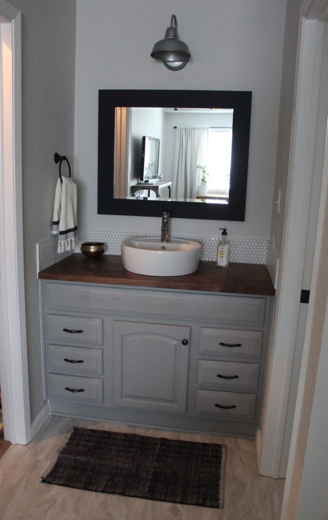
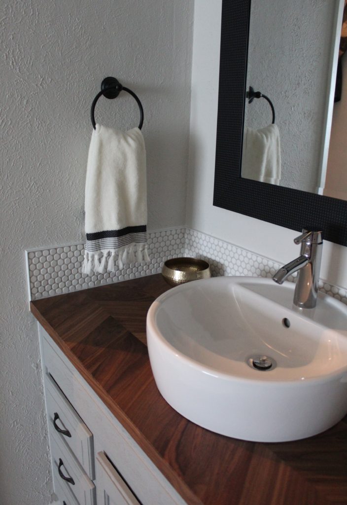
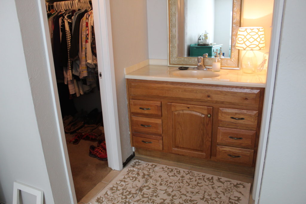
We used all the same materials that were used in our main bathroom. Same tiles on the floor, same countertop, same sink, you get the idea. Here’s an old shot I dug up of this same spot right after our move.
So what do you guys think? Is there anyone out there who recently took on a similar DIY bathroom project? Any first-time tilers who are contemplating getting started? Were you as nervous as we were? Really, once you dive in it’s not that scary. I’d love to hear from you so feel free to leave me a comment below:-)



our bathroom makeover reveal

It’s a happy, happy day. The day where we finished our bathroom makeover and I no longer have to hide my face in embarrassment when a guest uses our bathroom. The total span of this project was completed over the course of a week during evenings (hello crazy house with homework, dinner, a newborn, and a bathroom under construction) but we have been making plans and gathering our materials for several weeks now.

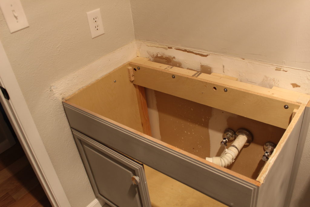
First, we should remind everyone how things looked before we started. I often hear many tales of DIY about how things have to get worse before they get better but I am confident our bathroom looked pretty scary from the get-go.

Here’s another shot of the room put back together. Although I still haven’t added any accessories, the room is mostly done. I have been shopping for some towel hooks, a vanity light, and some decor. Maybe a shelf or some art for above the toilet? Next week, I will be back with photos of the finished space with all the accessories and decor. You know, the fun stuff!

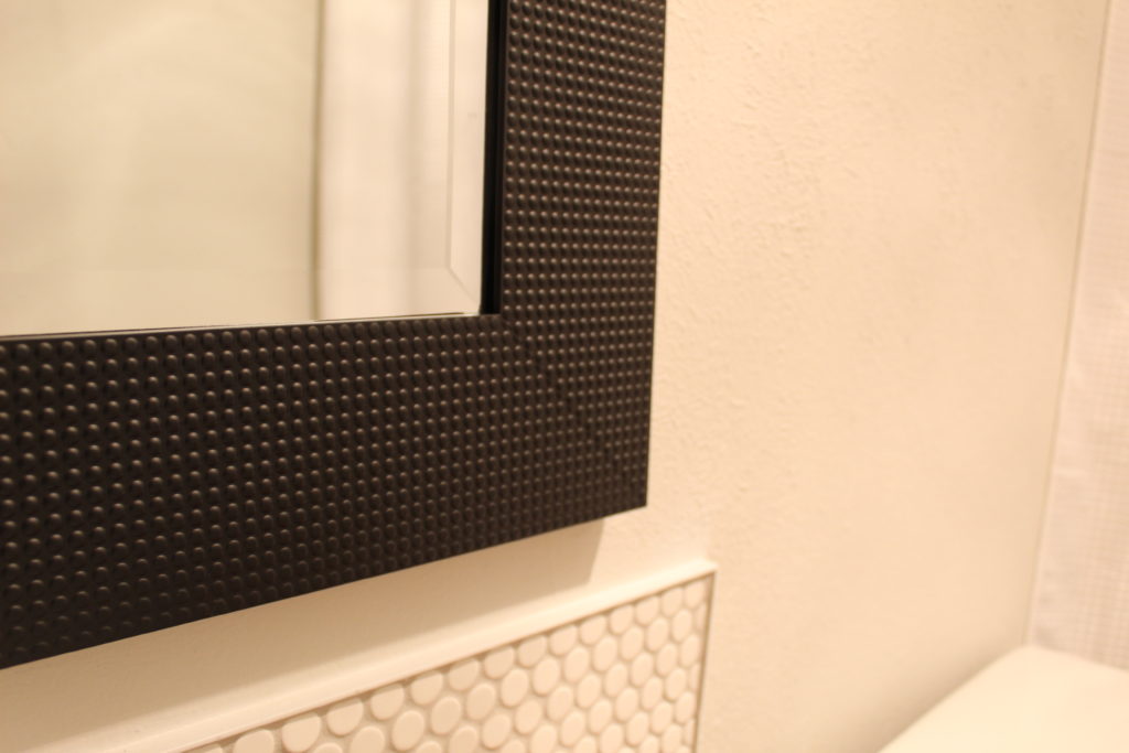
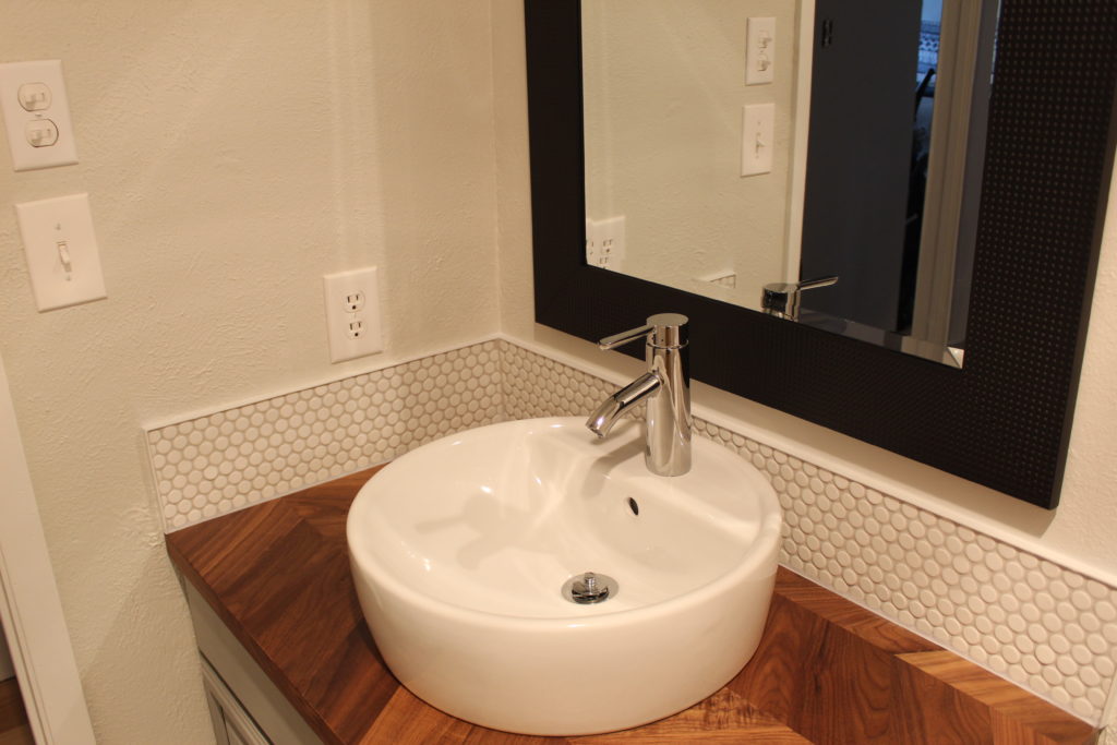
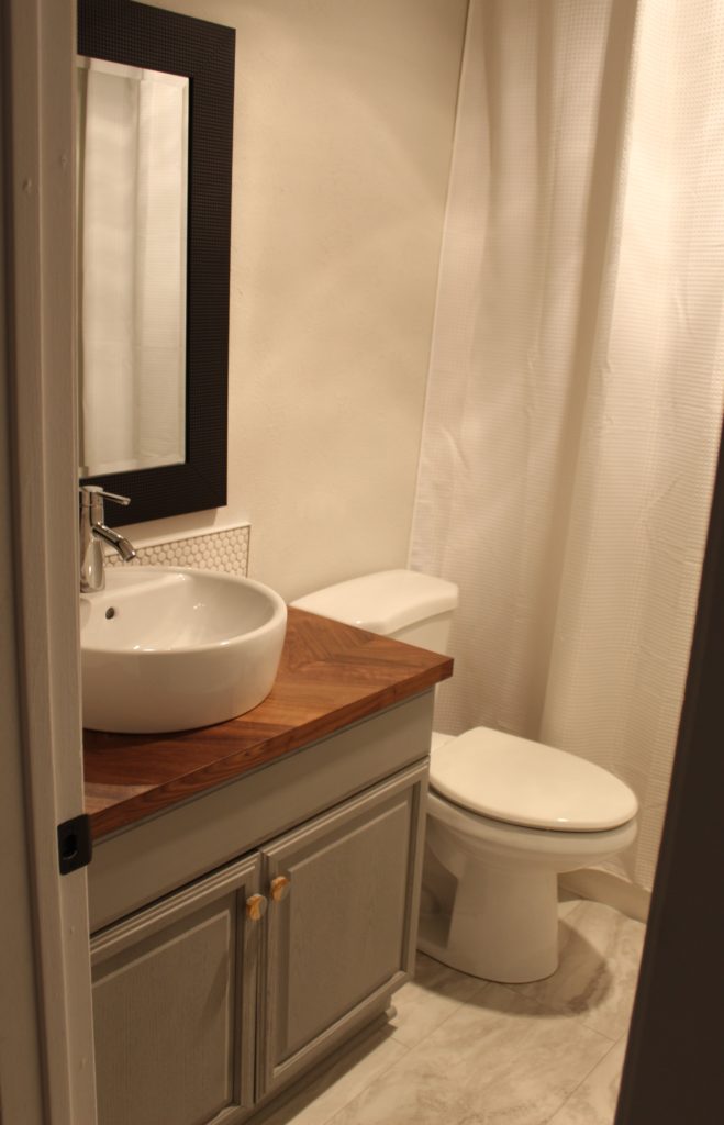
We found the mirror above the vanity for $30 and I painted the frame with a flat black spray paint. I am planning on bringing other black, metal elements in the room with the aforementioned accessories like towel hooks and a hand towel ring. Hopefully, that helps the mirror to not feel so crazy and heavy. But check out the little dot detail around the mirror…we loved how it mimicked the look of our new penny tile backsplash.

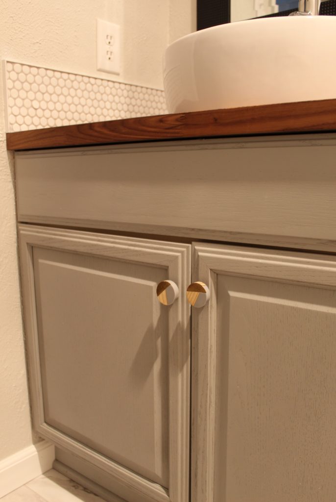
We began the bathroom overhaul with a fresh coat of paint for the vanity. Our vanity isn’t what I would choose if I were doing a bathroom from scratch, but it was installed right before we moved in. So I decided it would stay and we would do our best to freshen it up. After a coat of the new spray chalk paint from Lowe’s in Woolen Stocking and some new knobs from Hobby Lobby, the vanity was done.

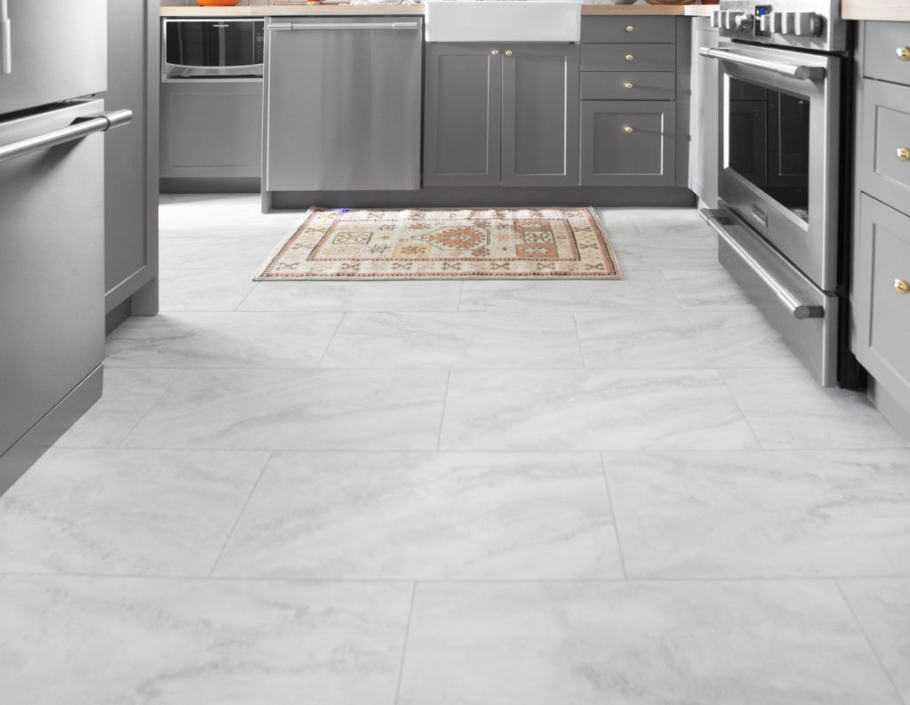
Next up was new flooring. One of my favorite bloggers used this tile a while back in a kitchen that they remodeled for one of their readers and I have been obsessed ever since. Look how lovely it is.

Via

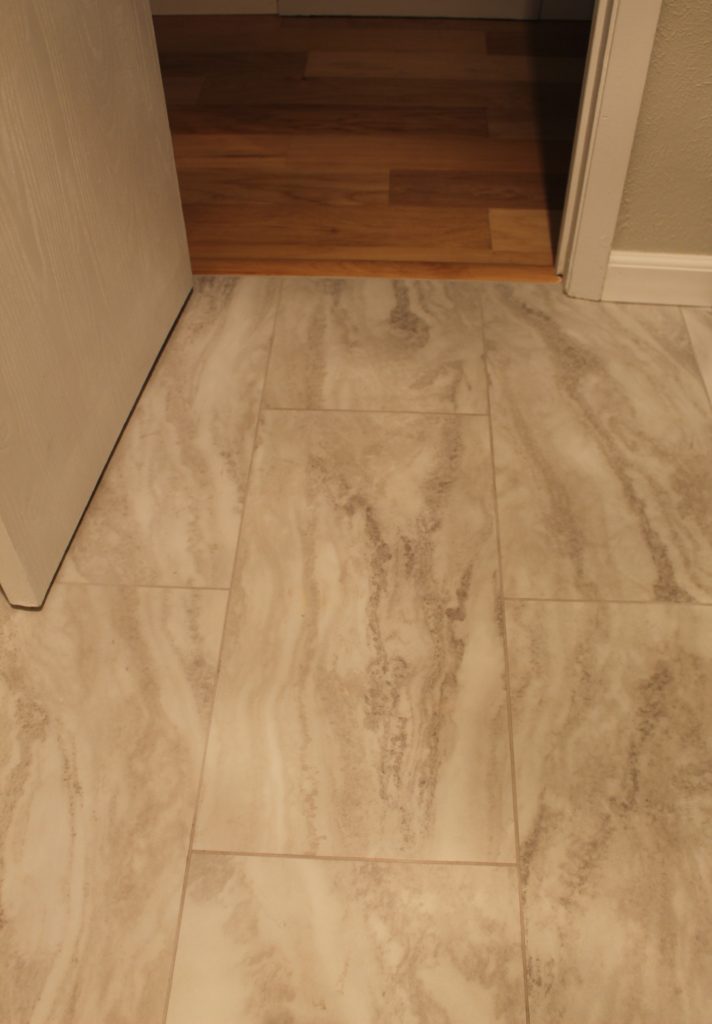
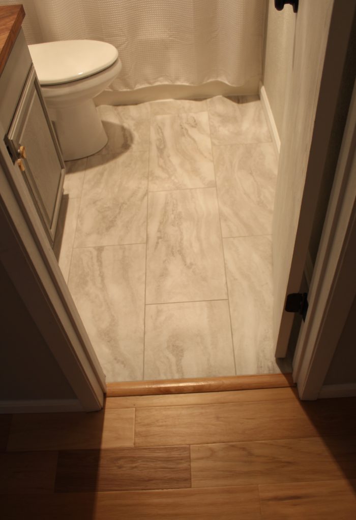
We love this flooring so much. First, it’s a very affordable option with a very high-end feel. Although it’s a vinyl product, it has a marble look and feel and we’ve had neighbors over who thought it was real marble. I feel fancy just typing that. We were surprised to learn that the vinyl was thick enough for us to use grout between each tile much like you would with a real stone. A couple other perks would be that it was easy to install because you don’t need a tile saw and it’s warm underfoot unlike real stone which can be quite cold on bare toes. Also, the tiles have quite a bit of texture so no need to worry about a kiddo slipping on them when they hop out of the bath still covered in soap and bubbles. Try not to judge me for my terrible photography skills. This room is a challenge to take photos in with zero natural light and super tight quarters. Just sayin…

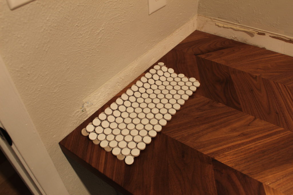
After we removed our old counter and sink, we discovered we were going to have a problem with the texture on the walls. There was no texture behind the old backsplash. Our house has crazy texture on all the walls. When I think of it, it reminds me of the meringue on top of a lemon meringue pie. In the recipe, it always says to whip the topping until you have stiff peaks. Our walls are covered in those stiff peaks. Ugghhhh. This left us with two options; try to recreate the stiff peaks and extend them down to the top of the new counter or cover this problem with a new backsplash. It didn’t take us long to decide we would trying our hands at tiling. #aintnobodygottimeforthat

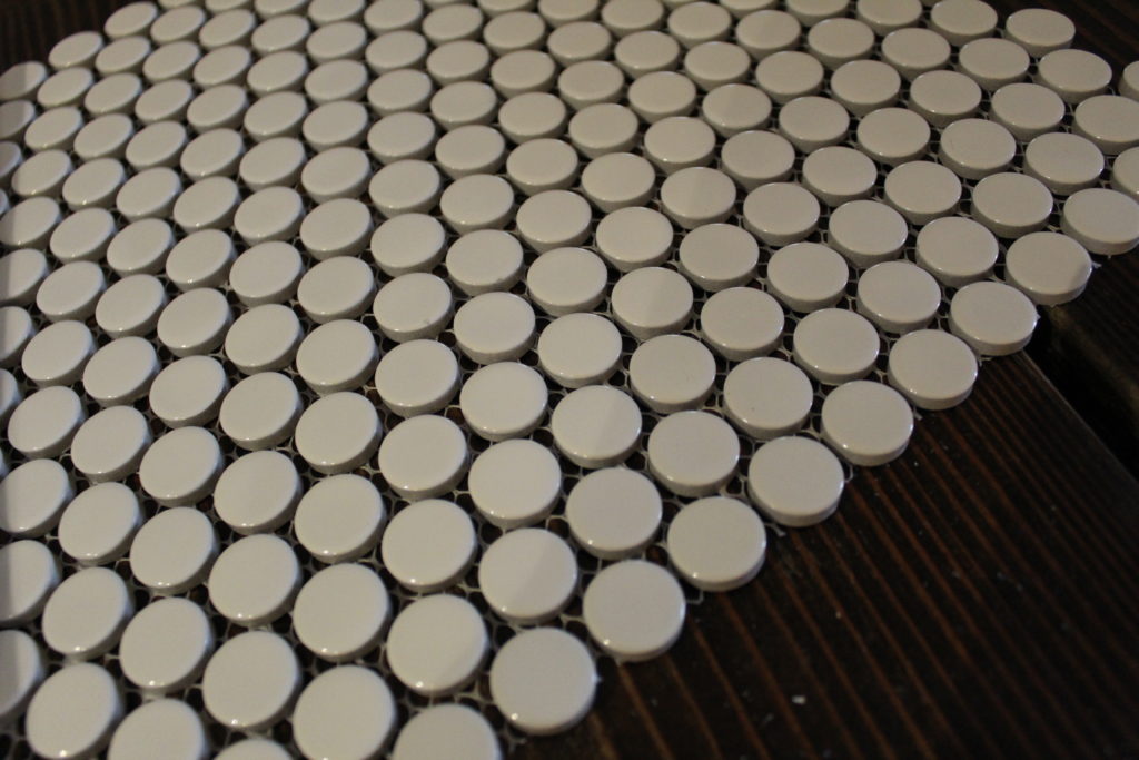
We went shopping for tile at The Tile Shop and had such a good experience. Their sales peeps were so helpful and knowledgeable without being pushy. I found the section with the penny rounds and fell in love. I fell hard and fast. The problem was (if you consider lots of beautiful options to be a problem) going to be deciding on just one! Nate was actually the one who helped me to keep my head out of the clouds and suggested we go with a crisp, white, ceramic style. They quickly set us up with everything we would need to get this project done. We will definitely be shopping there again.

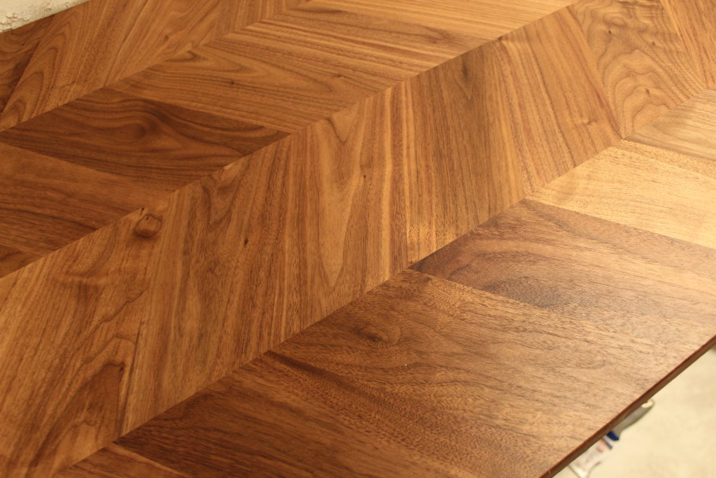
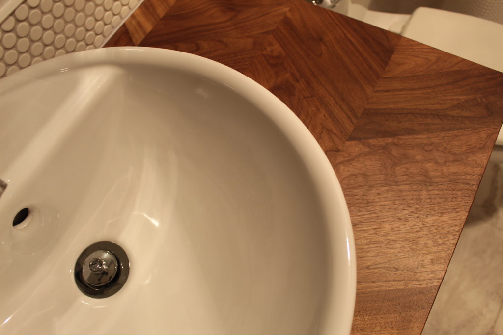
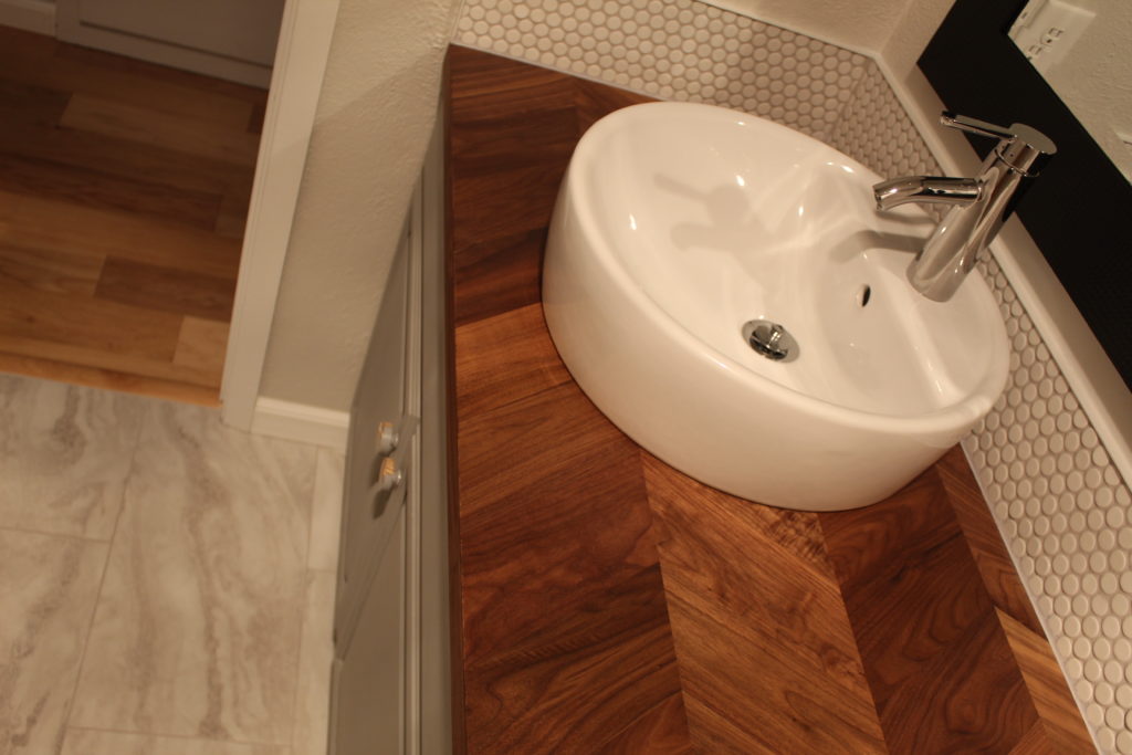
The rest of our materials were all bought at IKEA. We chose a butcher block style countertop, a vessel sink, and one of their faucets. We did a lot of research before we decided on butcher block for the bathroom. Like everyone else, we worried that it might not be a good fit because of the moisture in a bathroom. But as long as we watch for signs of damage or rot, and use a product like polyurethane or waterlox to seal it, then the wood should stay moisture free and beautiful. The butcher block we chose is a new product at IKEA and has a herringbone design in the wood. We love the extra detail.

We were on a tight budget to do this project and decided early on that the tub and shower surround would have to stay. It’s actually in good condition and we knew that replacing it would eat up a good portion of the budget. So we shifted our focus to just the cosmetic updates, and I am so happy we did! Now for all the fun shots of our finished bathroom…

We are feeling pretty proud of ourselves for completing this project all while keeping our kids alive and managing to stay married. Next up, we have been busy FINALLY replacing the overhead lighting that we took down when we scraped the popcorn ceilings. And yes, I realize that was months ago.