Our En Suite Bathroom Reveal!

Hi guys! We’re starting this year off with a bang with a brand new bathroom reveal! This project is a first for us, because this bathroom project wasn’t our typical remodel. It actually didn’t even exist when we bought our house. Confused? Let me explain.

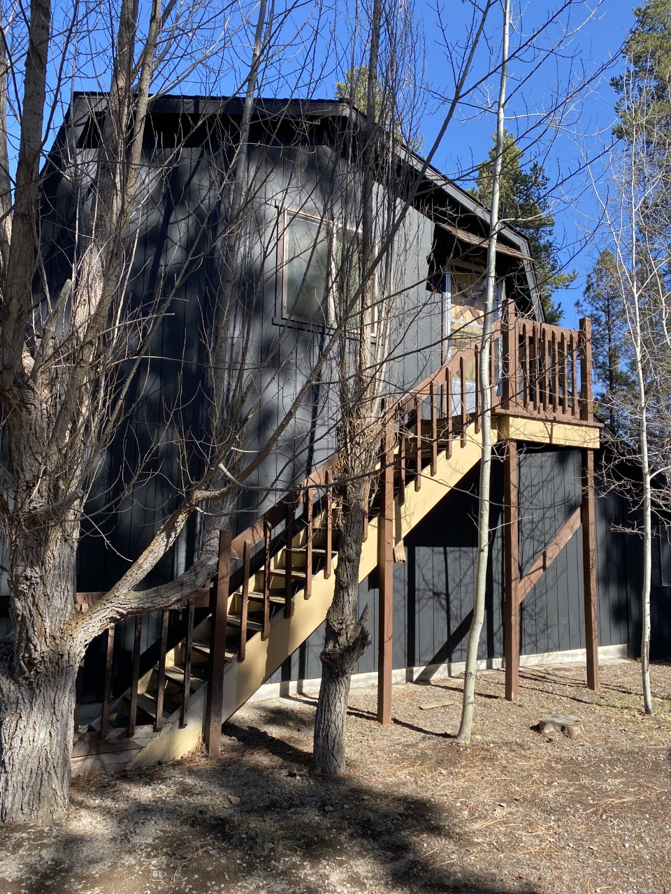
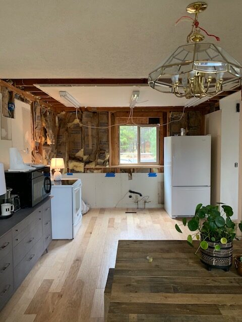
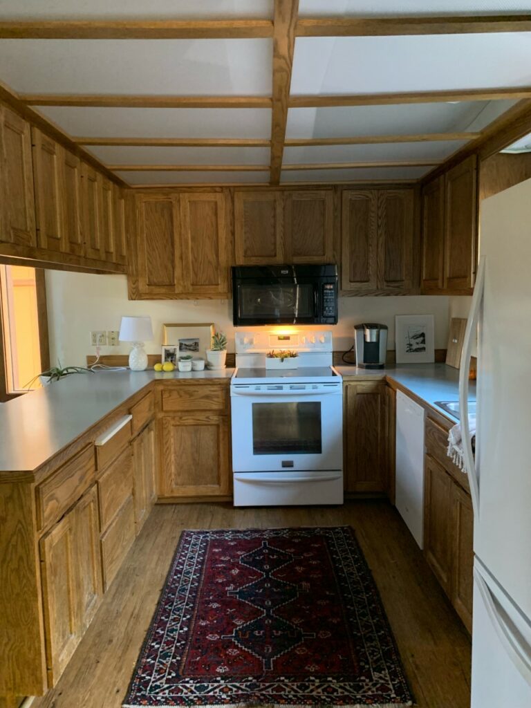
Back in the fall of 2019, we purchased this old fixer upper, knowing that there had been a bedroom addition that was added onto the original floor plan some time during the 1990’s. It was in rough shape though; we’re talking no HVAC, no insulation, and no foundation. The other BIG issue with the space was that there was no way to access it, unless you went through the second bedroom. As a family of five, we desperately needed this bedroom and the extra square footage that it added to our modest size home. So….after meeting with an architect, several engineers, and five different builders, we had plans drawn up to fix this addition and slightly modify our floor plan to accommodate a new bedroom, a new bathroom (EEK!), and a closet.

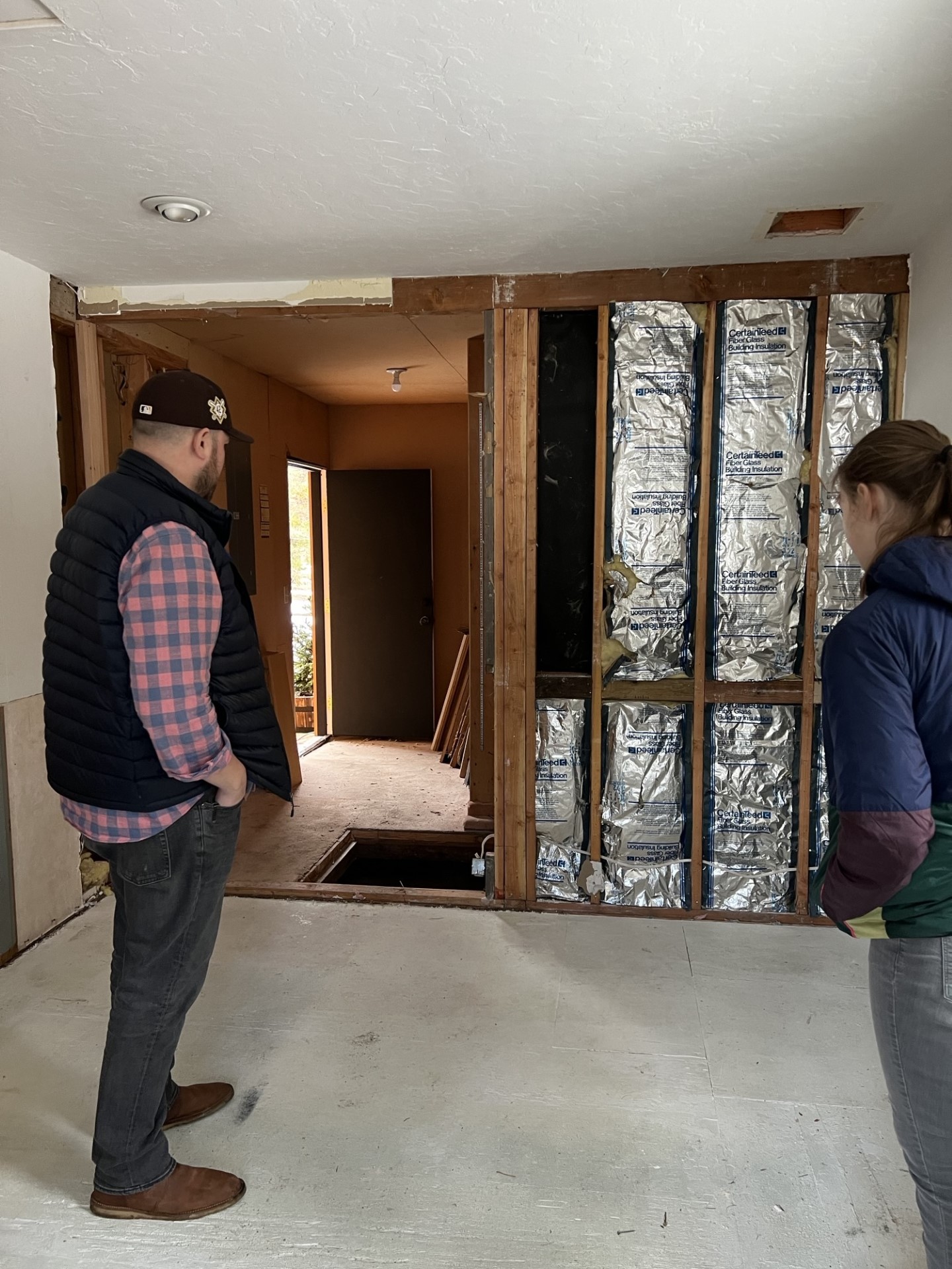
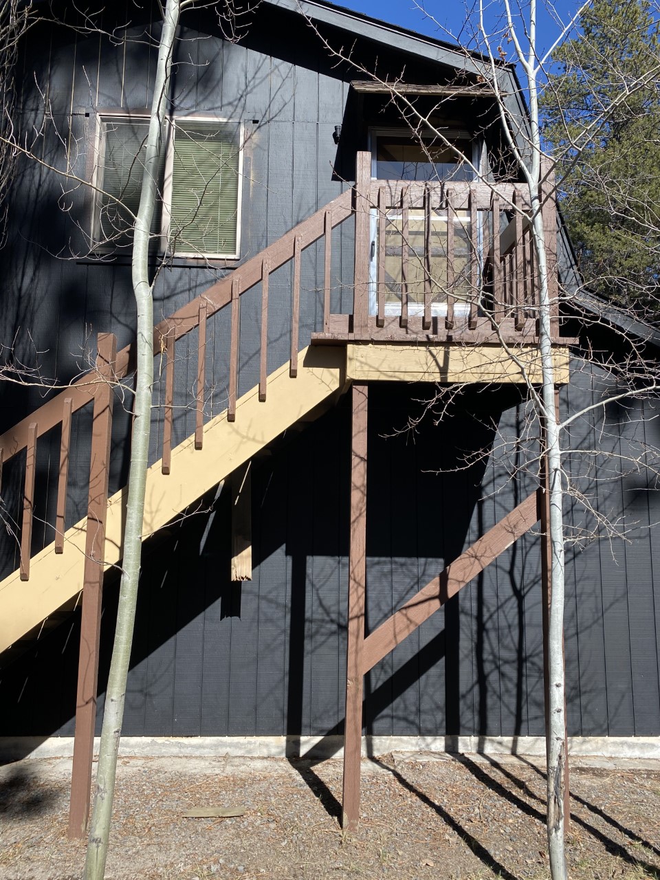
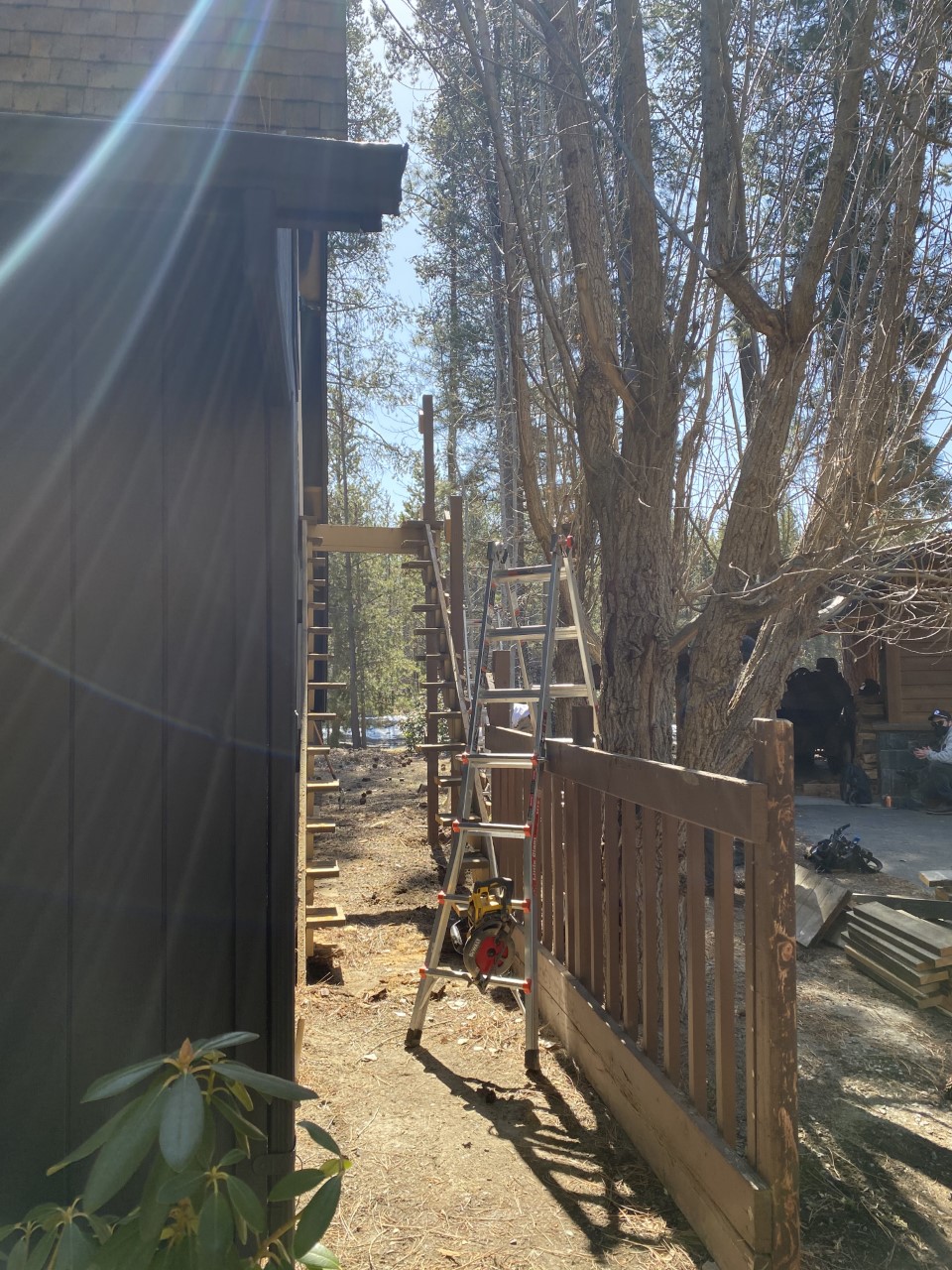
This photo was taken right after we started construction and eventually would be the site of the new bathroom and closet.

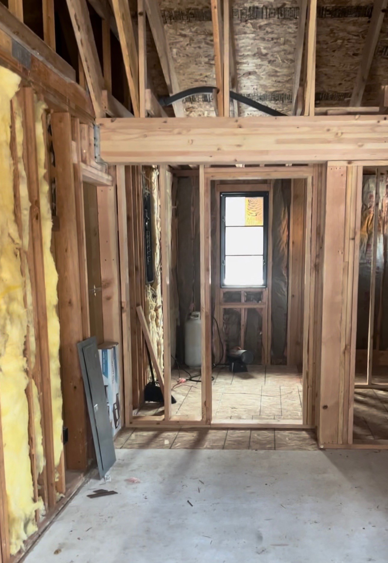
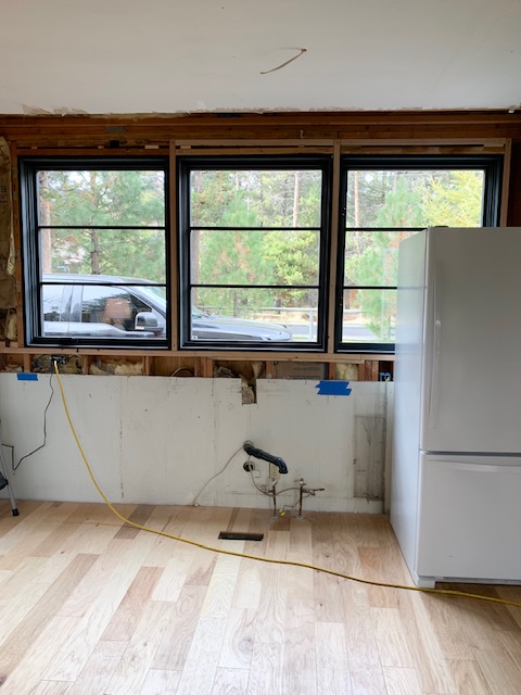
The framing was next up in the construction process, and this is when I started to really get excited about having our very own en suite bathroom. A space solely designed for Nate and me. No kids…just for us. Sounds like a dream, right?! I thought so too!

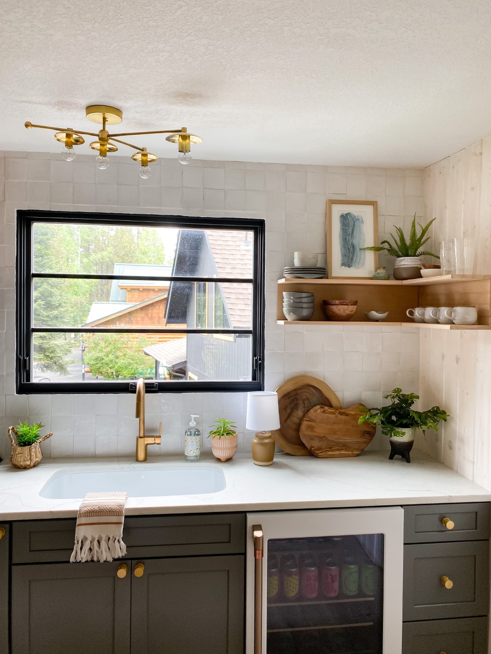
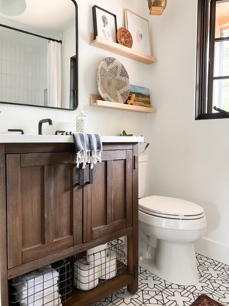
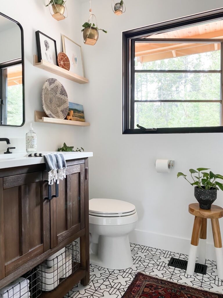
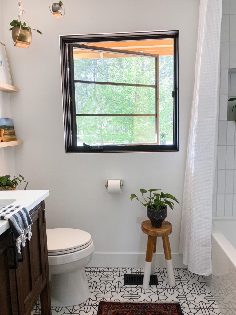
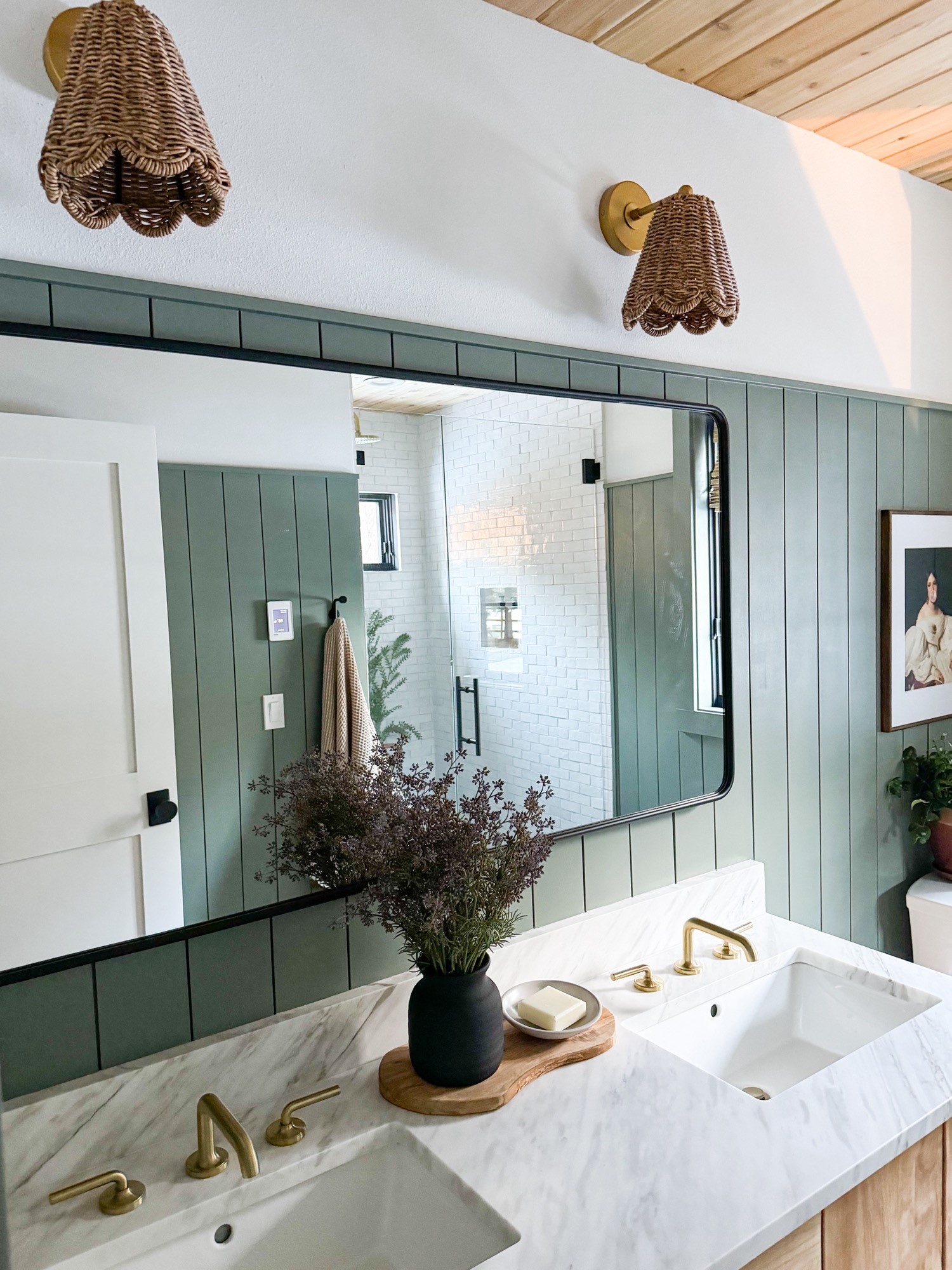
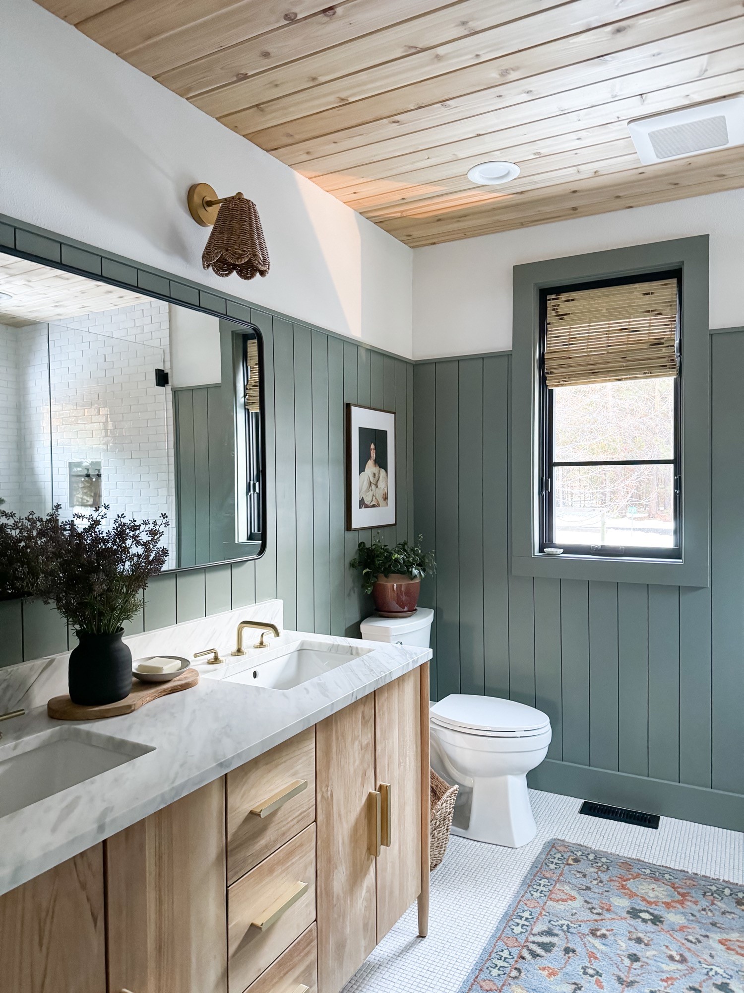
The floor plan for the space was a simple L-shape, with enough room for a double vanity, the toilet, and a walk-in style shower. My vision for the new bathroom was pretty straightforward. Not a lot of frills. Nothing fancy. So, we began the design process with tile selection. Enter Ann Sacks. Ann Sacks is my absolute favorite source for all things tile. They carry all of the latest tile trends, as well as the classics. I’m probably their biggest fan!

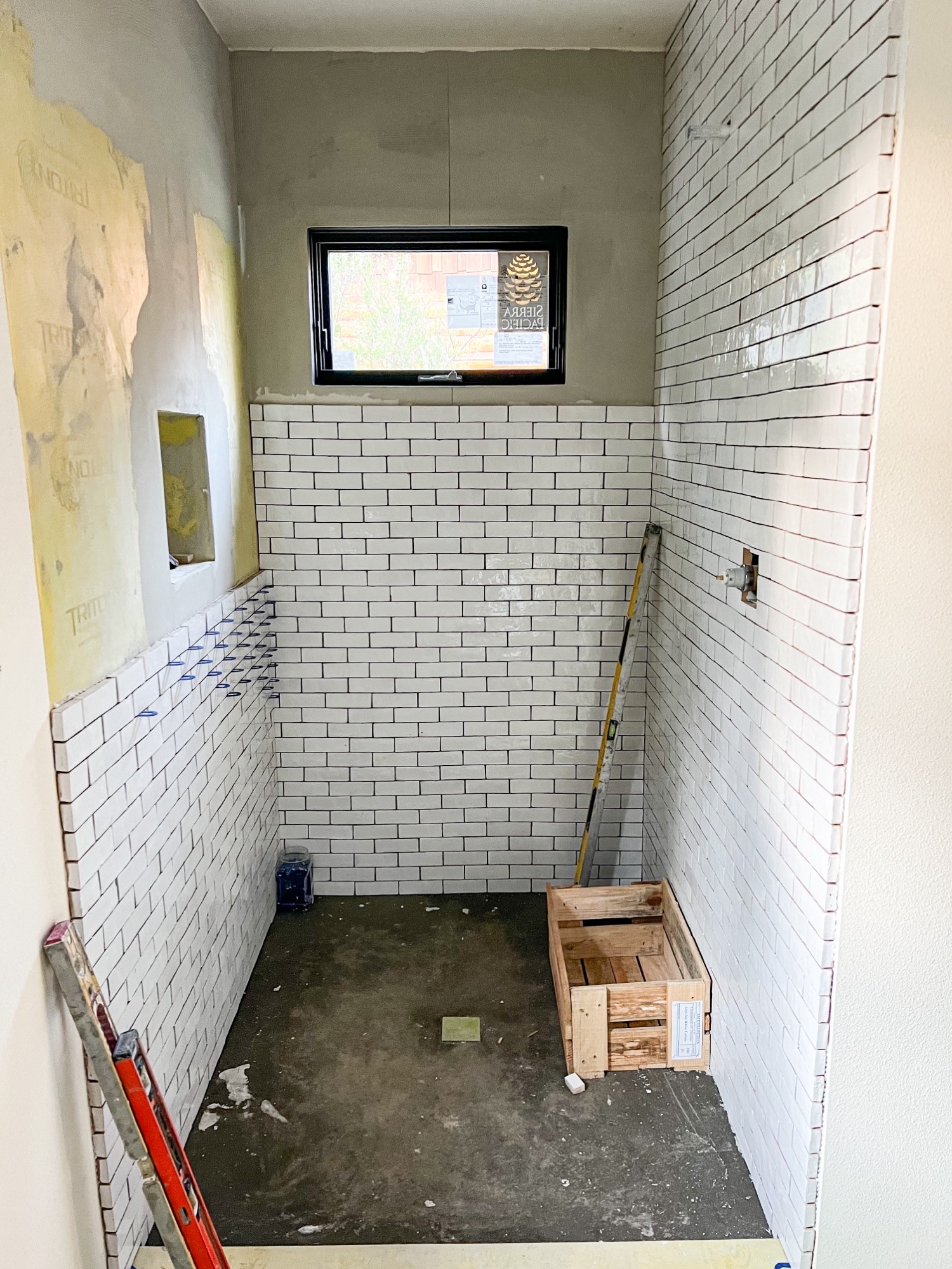
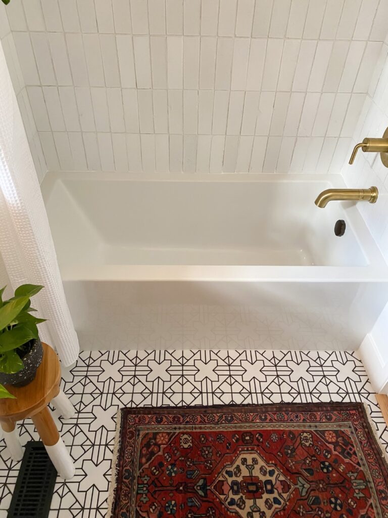
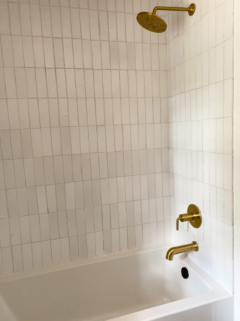
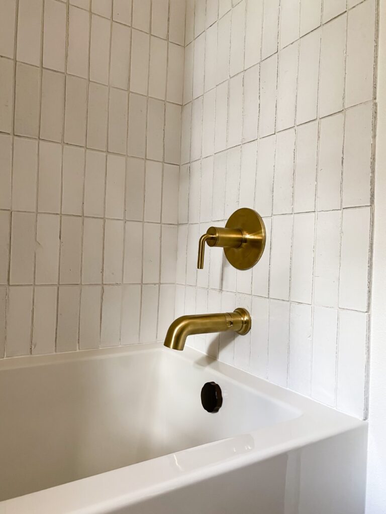
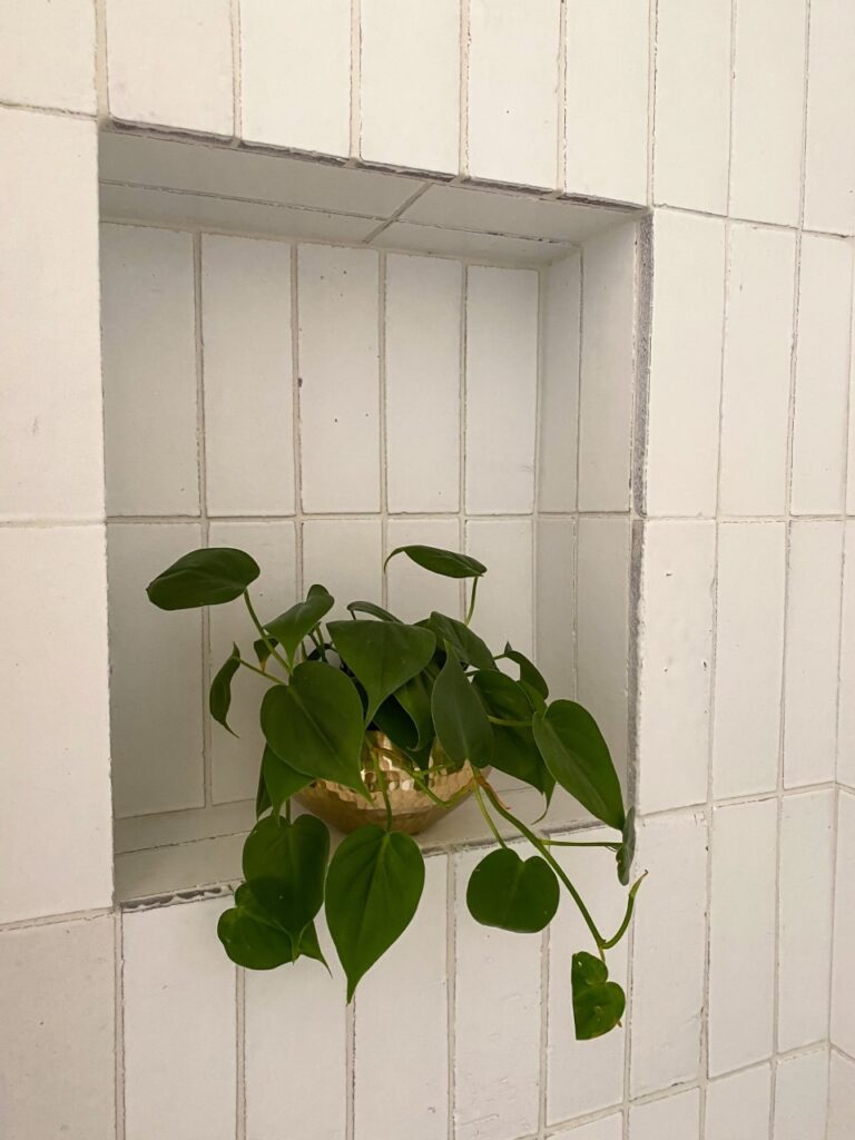
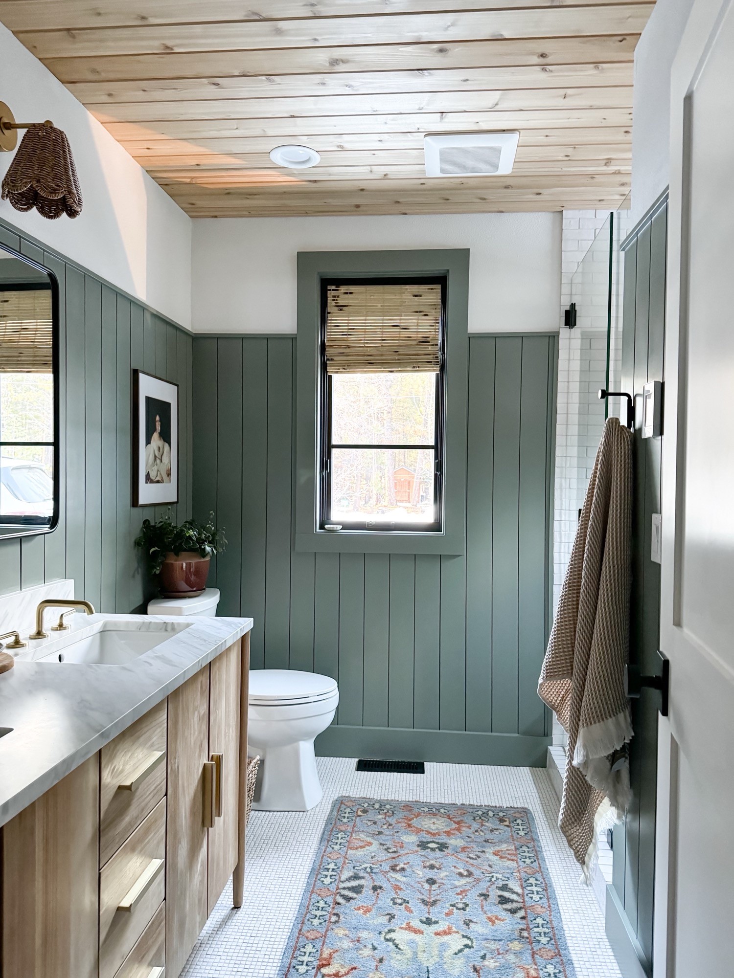
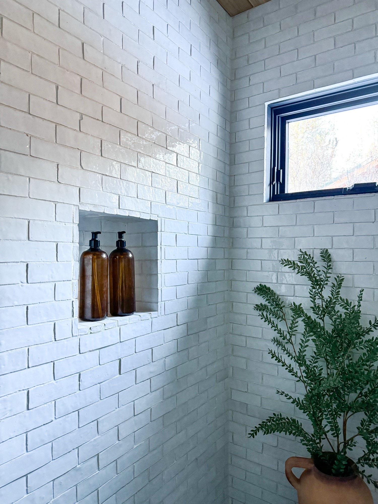
For the shower walls, we went with their Idris by Ait Manos field tile in the 2×6 size option. The color is called White Cararre and it’s the prettiest snowy white, while still having some variation from one tile to the next. This tile is special. It’s glossy, it’s glamorous, and yet, somehow still feels casual and organic. When the sun shines in the bathroom, the tiles really show off with an almost sparkly effect. I love it. For the grout, we went with a simple white.

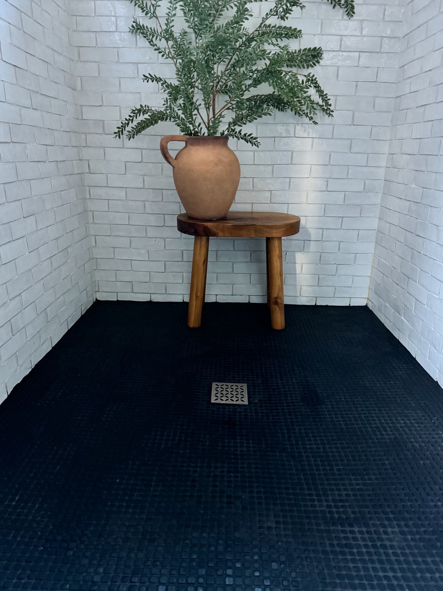
For the shower floors, we fell in love with their Salluto line. And for just a touch of drama, I went dark with their Nero color option. These tiles are tiny, but pack a punch! When you first glance at them, they almost look like a pebble you would find in nature. But, when you look closer, you’ll see that each tile is an imperfect square, and some have rounded edges that trick your eye into seeing some squares and some circles. They also have a matte finish that I love, but still reflect light. For the grout, I went with a complimentary black.

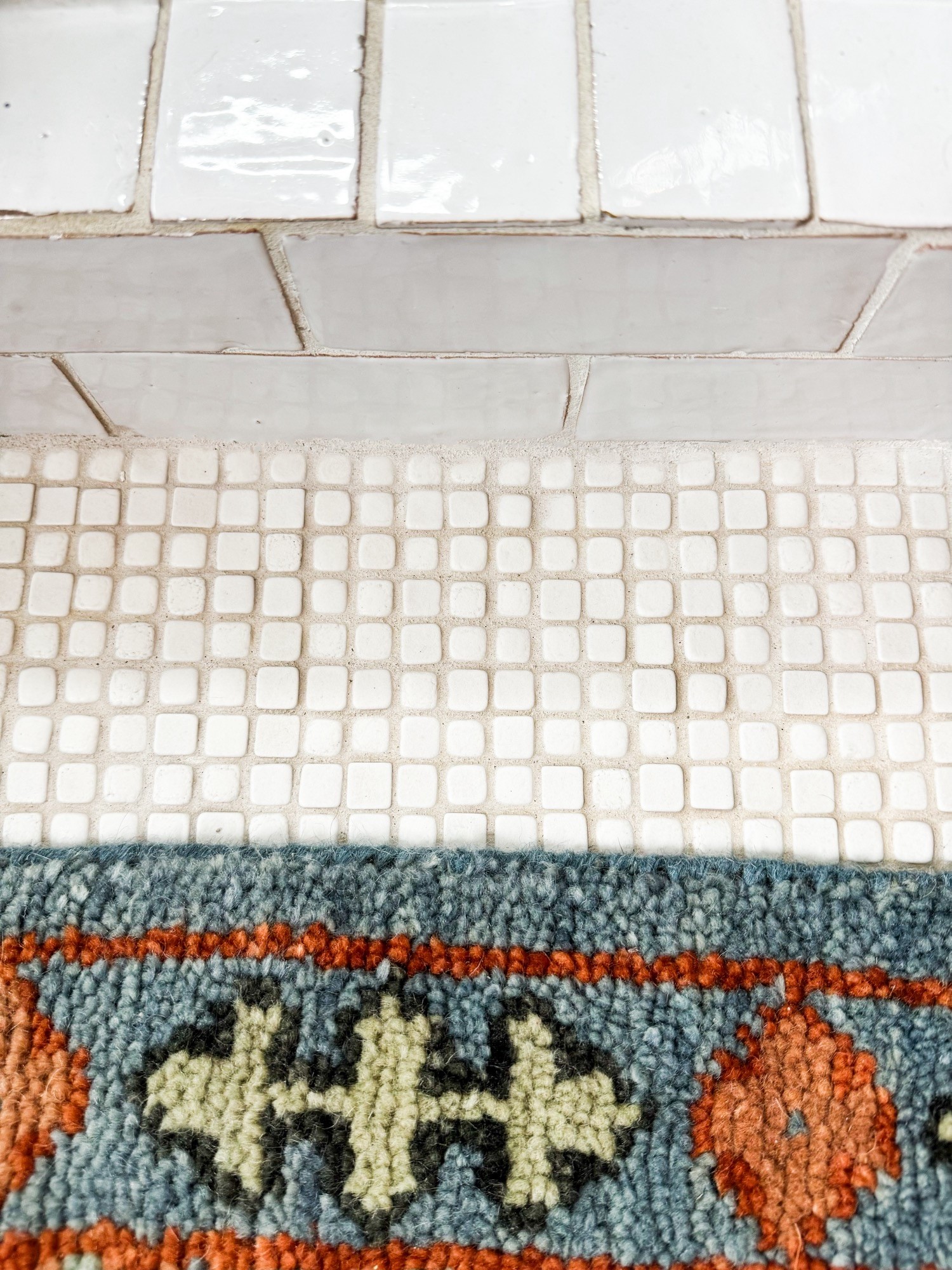
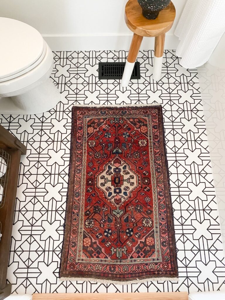
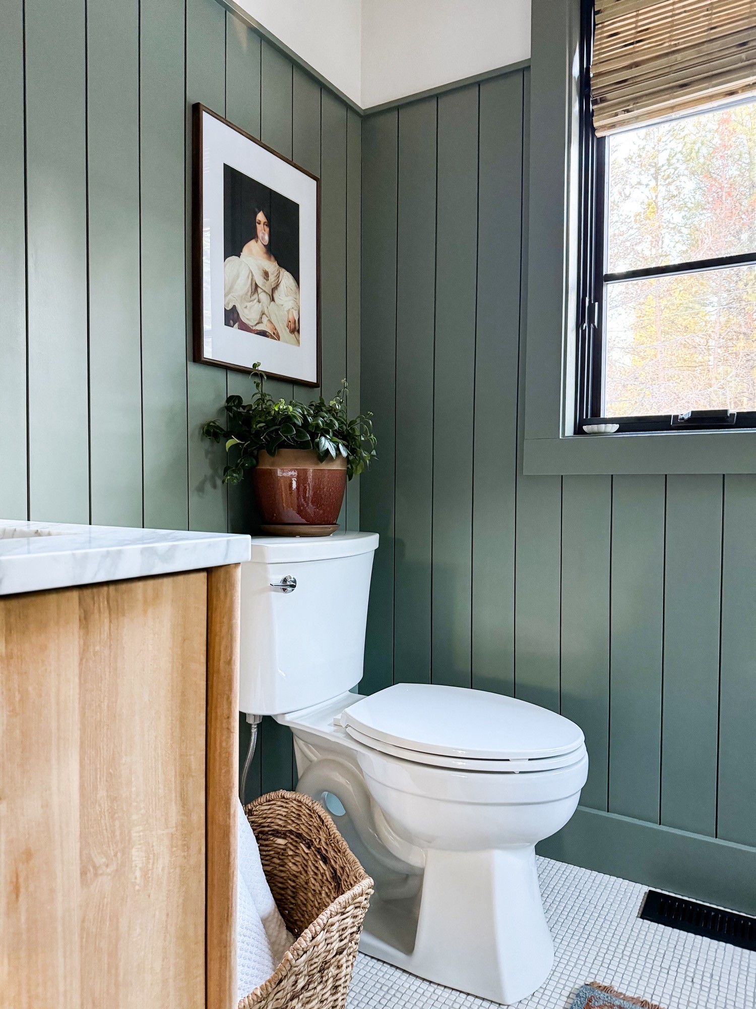
As for the rest of the floors in the bathroom, we used the Salluto line again, but this time, we switched out the Nero color for a creamy beige, called Bianco. I love the texture that it adds to the space and I especially love the way this tile feels underfoot. Almost like a little foot massage.

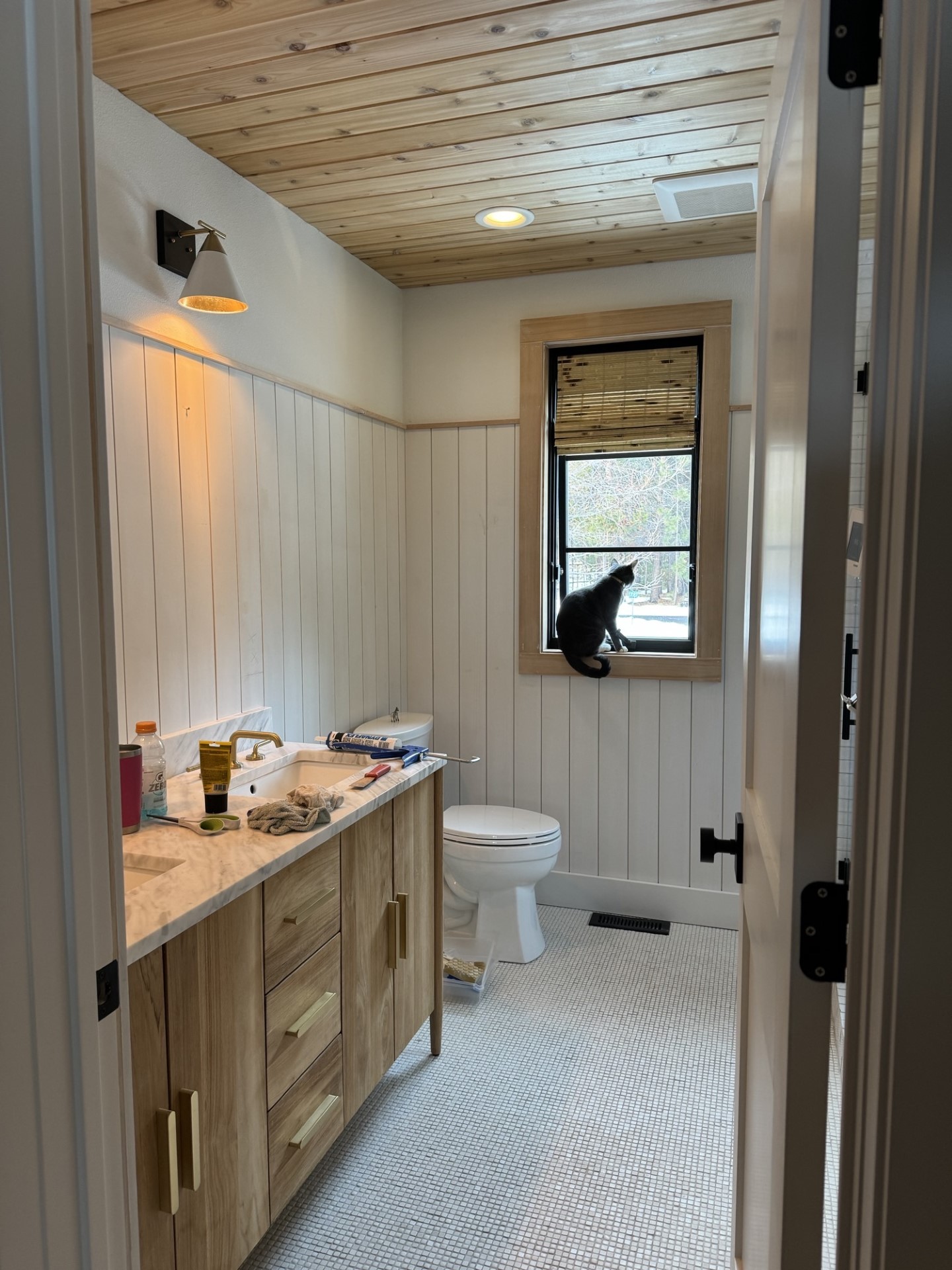
When the bathroom was finished, we immediately realized that the space was missing something. And after thinking on it for a few weeks, we decided that the bathroom needed some shiplap. We found this material at Lowe’s and I couldn’t love it more. I think it adds so much visual interest to the small space, and I love the pop of green that we used on the shiplap. The color is called Retreat by HGSW. It’s a moody green that looks different all the time, depending on the lighting.

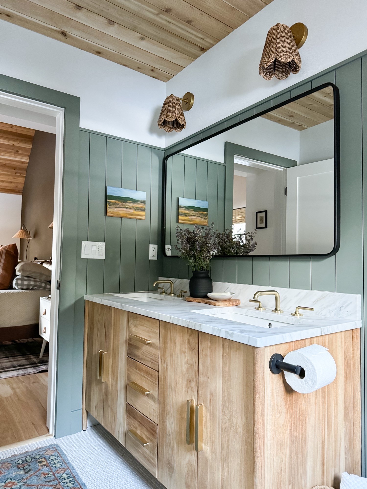
We selected this vanity that was really an easy choice for us. It’s made from solid teak – perfect for the bathroom and feels so well-made! Also, don’t ya just looooove that chunky hardware? Hubba hubba

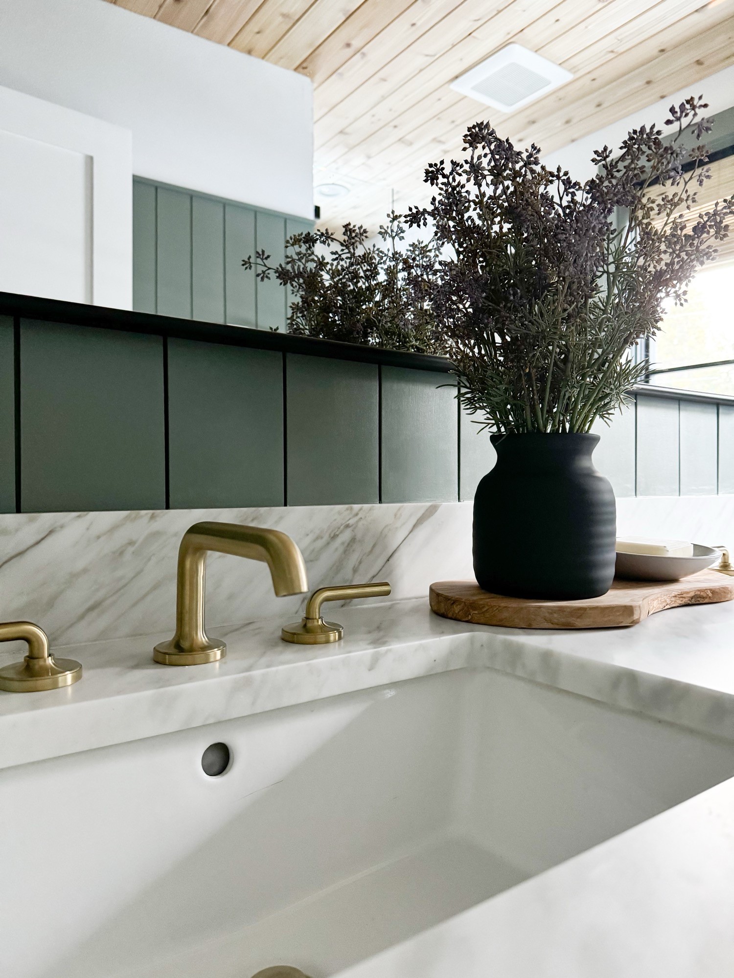
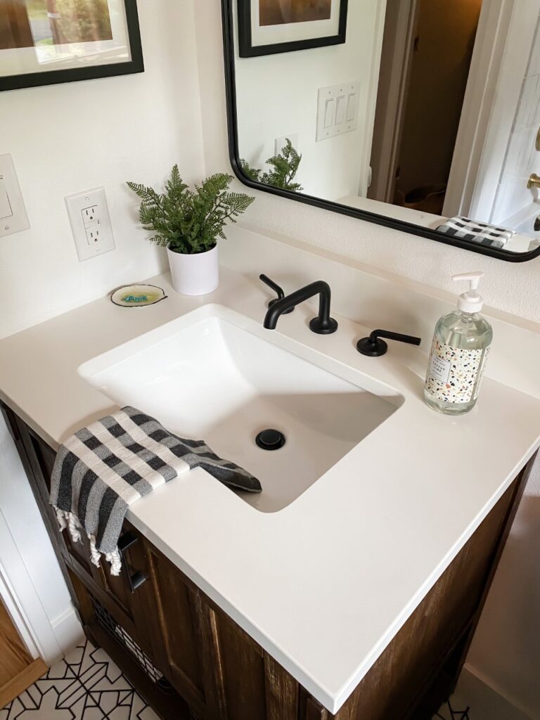
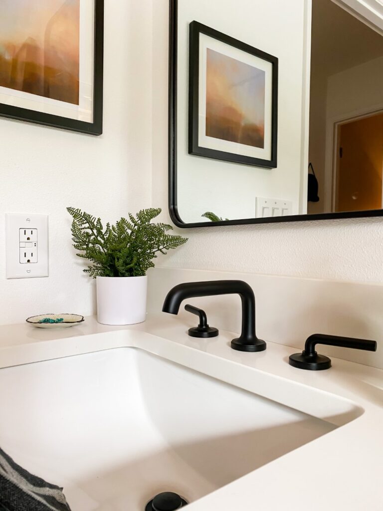
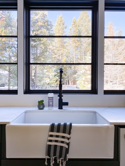
For the plumbing fixtures, we went with everything from the Tenet line from Pfister Faucets. I adore their brushed gold color option and the clean lines. It’s functional and beautiful. A winning combo, I think!

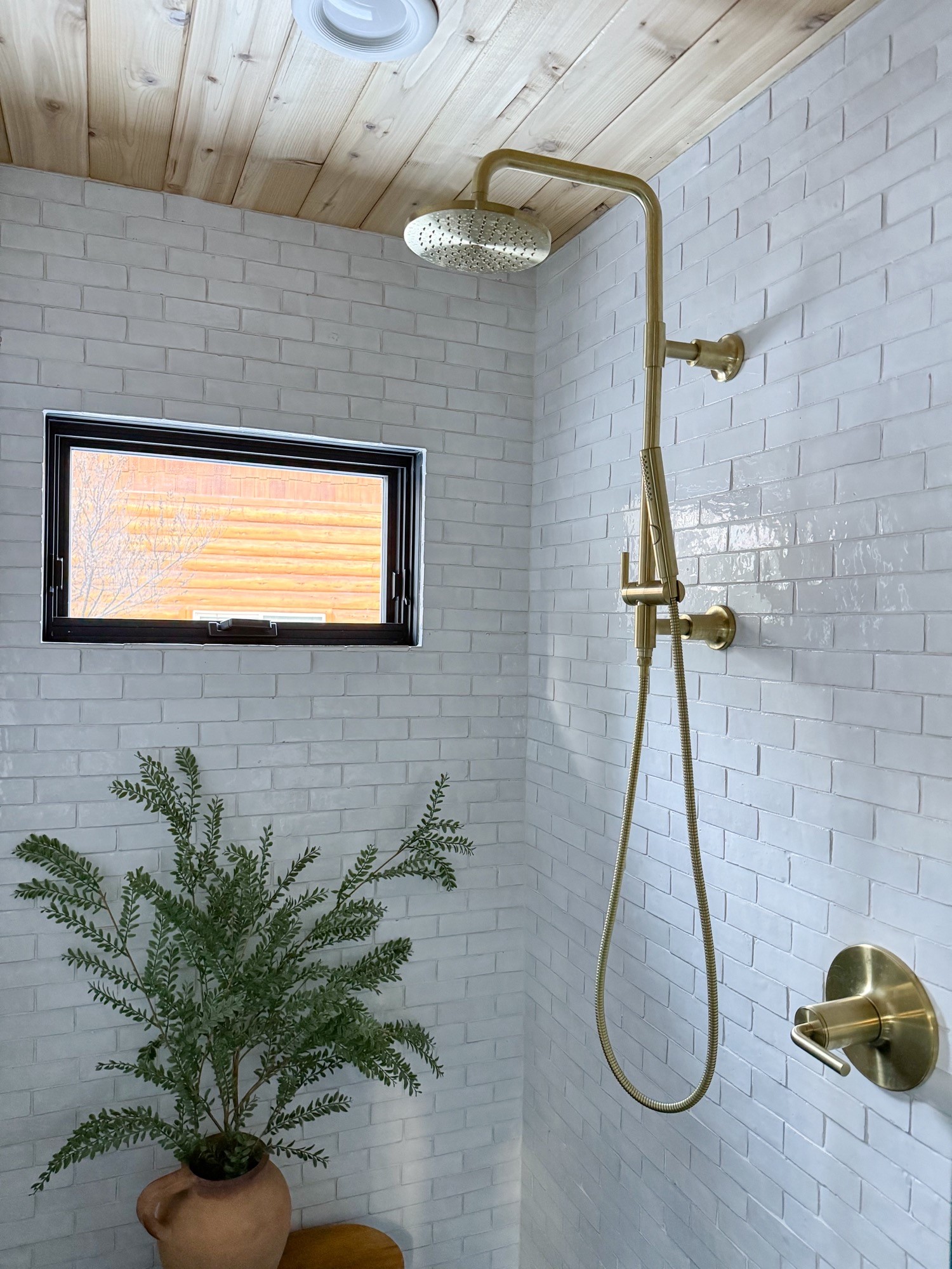
I especially love the handheld shower option, and is so nice for giving your hair that extra rinse. It also makes scrubbing up kids and/or pets a breeze!

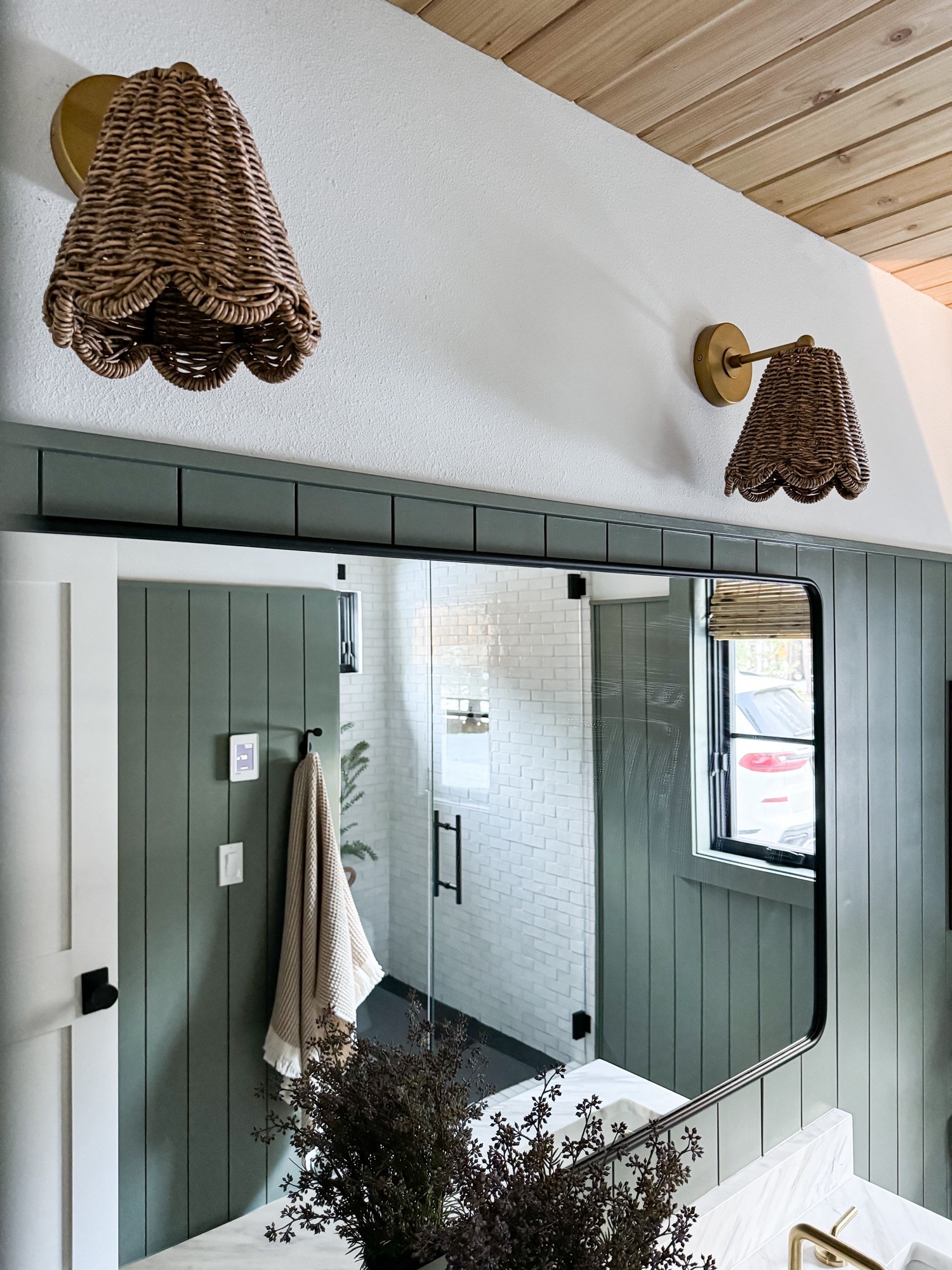
These sconces were quite the controversial topic over on my Instagram page, and lots of you had big opinions about them. I originally went with a different pair, but ultimately swapped them out for these ones. In the end, I couldn’t pass on that wicker shade or the scalloped detail. They cast the most lovely, filtered light at night that I’m kind of obsessed with, tbh. The mirror we selected is simple and adds a little pop of black, which I wanted to incorporate.

I know this bathroom build was a long process, and thank you guys for all of your support, and for always being our biggest cheerleaders. I’d love to hear what you guys think! Have a question for me? Leave me a comment below! I promise to write you back.

Sources

Paint colors:

White walls– Extra White by Sherwin Williams

Shiplap walls– Retreat by HGSW

Additional Sources:

Vanity

Rug

Shiplap

Floor Tile

Shower Tile

Wall Sconces

Mirror

Robe Hook

TP Holder

Bamboo Window Blind

Scalloped Towel Basket

Lady with a Bubble Print

Waffle Bath Towels

Windows

The Guest House Kitchenette is Done!

Today is an exciting day around our house! Our kitchenette in the guest house is finally complete and I am so dang excited about how it came out that I could shout it from the roof tops! I think we should just get right into it, because I just can’t wait to show you guys! Sorry in advance for the amount of !!!!! that you will see in this post…please forgive me in advance.

Ahhhhhh are you screaming yet??? Cause I am! My goal was to create a fun and collected space that didn’t feel too serious. I also wanted it to feel like it was related to the main house. Think cousins, but not twins, ya know? We had so much fun putting this little kitchen baby together, and I couldn’t be happier with this new look! Check out how this same space looked a few months ago…

The cabinetry was problematic, and like everything else in this old place, was in very poor working order. Saggy cabinet doors and drawers that were completely stuck in place! The biggest problem with the cabinetry before, aside from its ugliness, was that it wasn’t a well thought out use of space. Nothing about this sad space made sense. So, we decided early on that we would gut the entire thing, and start over fresh!

The started from the bottom and replaced a linoleum and carpet situation from the 80’s with the most beautiful engineered wood from Provenza Floors. These are from their Affinity Collection in the Couture Color option. I could write an entire post on how deep my love runs for these wood floors, so I think I will do just that! I will be back next week to give a play-by-play on everything about these beauties; like how the install process went for us and how they are holding up. Guys, seriously, these floors MAKE THE SPACE. But, more on that later!

The appliances are from Cafe and they are AMAZING. Our kitchen in the main house has appliances from Cafe, so I can attest to their quality. Cafe is really on the forefront of mixing beauty with functionality IMHO. They look great and function even better…it’s a win win. We went with this range for its double oven option. I’m thinking about all of the desserts that could go in the top tier while dinner is in the lower tier. Ummmm…..yes yes yes. Instead of going with a full-sized refrigerator, which would remain mostly empty, most of the time, we opted for this beverage center which offers up a surprising amount of  storage but with all spots for storing wine/water bottles. It’s been really fun to stock the beverage center with drinks for our guests. When my Mom and Dad come over to stay, I fill it up with sparkling waters for my Mom and some bottles of Pinot for my Dad.

For the countertops, we enlisted the help of our friends at Nelson Tile & Stone, who also did our countertops in the main house. We decided on their Calcatta Quartz, in the Valentin color. It’s soft and subtle, with veining in both gray and gold tones. It’s STUNNING! And just as an FYI, they keep this particular stone in stock! We love everyone at Nelson Tile & Stone, and Jennifer, was instrumental in the design process of the space. She helped me decide on the stone itself,  then found the perfect faucet, (it was exactly what I was picturing) and even a drain to match!

The tile is from Ann Sacks and I smile every time I see it. Seriously, it’s that good! This is their Idris by Ait Manos in the 4×4 size. I went with the White Carrare color, but Ann Sacks carries this tile in six other colors. I have been drooling over the powder pink color for our next bathroom remodel and think I even have Nate talked into the idea of a pink shower! The cool thing about these tiles is that they are all hand-made and offer up an earthy, organic vibe to any space, which works in just about any style of home. Each piece is a little different from the next and I just love that!

This showpiece of a light is from Sazerac Stitches. This is their Cancer Flushmount and can be used as a flushmount fixture or a sconce! Cool, right? This hand-made brass work of art is designed to look like the cancer astrological constellation. The combos of socket and disc sizes, as well as arms with brass balls mimic the look of the small and large stars in the constellation. This piece in particular, saved the day for me and solved the issue of the lighting placement not being centered above the window/sink. The assymetrical design creates the illusion that the light is centered in the space. And the brass complements the cabinet hardware and faucet just perfectly! Sazerac Stitches has a variety of styles, and their designs are unique and offer something unexpected, if you are wanting to add some serious pizzazz to your home. I have another cutie from Sazerac Stitches that’s going up soon when work on the rest of this space! I can’t wait to show you that one!

The cabinet hardware is also brass and I am digging the simplicity of it! With just a few cabinets in our small space, I wanted the cabinet hardware to not steal the show from the other elements in the space. I think these little round beauties, do just that! They are also surprisingly substantial, and are quite heavy!

Ok guys! I think that’s about it…did I miss anything? So what do ya think? As always, a big thank you goes out to all of you for cheering us on throughout this project! Your questions, comments, and support really mean the world to me and make big projects like this one, so much more fun! Leave me a comment below and tell me what you think of the new space! I’d love to hear your thoughts!


Trex Stairs And Cable Railing…The Combo That Won My Whole Heart

This post is sponsored by Webfoot Painting

When we first bought our house in the fall of 2019, a MAJOR fixer upper, we were so excited to have a little guest house separate from our main house. It’s a small studio-style apartment that sits above our garage, complete with its own kitchenette and bathroom. You see, I have four siblings, who are all married with kids, so weekend house guests are a regular occurrence around these parts. I think the privacy and separate bathroom make it so popular with my extended fam, and it’s always fun to see who calls first dibs! There’s just one problem with the guest house, the stairs that lead up to the entrance were over 30 years old, and showing their age in a big way. In fact, one of treads broke while Nate was walking up them just after we moved in. We promptly banned their use after that, and decided we better get serious about replacing them before we had a real accident…gulp.

Enter Webfoot Painting to save the day! Webfoot is a local outfit here in Bend, and initially, I thought they were solely a painting company. Boy, was I wrongo! They offer a whole host of services including deck building, interior/exterior painting, carpentry services, concrete coatings and so much more! After seeing that they have over 500 google reviews with a 4.9 star rating, I knew we were in good hands going into this project. I was also happy to see that Webfoot is so involved in our small Oregon community, and even host an annual giveaway called Project Serious, that donates $25k of services to a deserving local non-profit. How cool is that?!

Not only were the old stairs a safety hazard, they were also UGLY. They were a lovely shade of gold with lots of brown accents…ahem, insert sarcasm here. This was the color combination on the exterior of the house when we moved in. Maybe even the original color to the house from when it was built in the early 1980’s, I wonder?

Anyone else getting a haunted house vibe? No? Just me? Anyways, the crew from Webfoot arrived on the first day and made quick work of the old stairs. They were gone in just a few short hours!

After the stairs were nothing more than a distant memory, we swapped out the old window and door for a fresh new look and a fun pop of color! All ready for the guys to come back and start building the new stairs!

The next day, Webfoot showed up right on time, and got to work! The crew was awesome, and their communication was so on point, we always knew the action plan for the day.

I was so excited to use Trex on the stairs for it’s durability, zero maintenance, and scratch resistance. We hemmed and hawed over all of the beautiful color options, but ultimately went with the Havana Gold color from their Transcend line. It has a lot of great texture, and really looks like wood – without the maintenance that comes with real wood. I also learned that Trex is made from 95% recycled materials, which made my inner Oregonian feel v happy.

These sleek and dare I say, sexy railings were a custom design by American Structures out of Portland, and are powder coated for durability against the outside elements. The crew even provided us with touch-up paint if we ever manage to scratch them – great for peace of mind! The black cables were sourced locally from Bend Rigging & Supply. The finished look is modern and clean. I couldn’t love it more!

Webfoot is one of the largest Trex deck builders in the state of Oregon, and their experience showed through their craftsmanship and attention to detail. The guys told me this stair design is called a “picture frame,” and it’s just beautiful!

Ok…now to the good part! It’s time to SPAM YOU WITH ALL THE GORGEOUS AFTER SHOTS…

Overall, we are so grateful for such an amazing experience, and couldn’t be happier with our new stairs. We’ve had just about all of our neighbors stop by to tell us how much they love the upgrade! A big thank you goes out to Gavin, Colin, and everyone at Webfoot Painting who were all knowledgeable, friendly, easy to work with, and full of energy! So tell me guys, what do you think!? Do you have any home projects that have been on your to-do list? I’m already busy dreaming up our next one!


Bathroom Reveal…It’s Finally Done!

Hiya guys! I can hardly believe that I’m typing these words, but THE BATHROOM IS DONE!!! Even though this was a small space (just 5’x8′!), it was definitely one of the more challenging spaces that we’ve remodeled. COVID certainly didn’t help, and we found ourselves without supplies that we just couldn’t get our hands on for weeks at a time. At one point, we ran out of grout, and thought we would be able to simply pick some more up curbside from our local home depot, but they were out of stock. So, we ordered from them online, and didn’t receive it for almost three weeks. Insert eye roll here. But, that’s all in the past, and I can’t wait to show you how it looks now!

I thought it would be fun to take a trip down memory lane and have a look at this space pre-renovation. Allow me to set the mood…think lots of dark, oak cabinetry from the 1980’s, reflective shower doors (adjacent to the toilet, so I’ll let that sink in for a sec), and the color brown for dayzzzzz. WARNING – it was so bad!

The space just felt sad. I assumed that it hadn’t been updated since the house was originally built in 1984, but we found wallpaper behind the cabinets so I guess it had to have been updated at some point. Scary, but true! In addition to how bad it looked, it also didn’t function well. The cabinet above the toilet was a hazard, and we were always bumping our heads on the doors when they were left open, which they always were. The faucet was leaking, and constantly had a small stream of water running down into the sink. The shower doors spent more time off of their tracks than on. Finally, the shower head was so low that Nate and I both had to crouch just to fit underneath for rinsing off during a shower.

The bathroom is so small that I decided early on that leaving the layout as is would be the best choice. Tip for ya; if you’re thinking about starting a bathroom renovation (or any room, really!), keeping the existing layout will save you lots of dough, in terms of budget. Moving plumbing/electrical is costly, and you’ll be forced to hire that work out. With that said, don’t be afraid TO hire work out, if needed. Nate and I aren’t comfortable with drywall/texture work, and can’t achieve the look of a professional no matter how hard we try…and trust me, we’ve tried! We always hire that out, and I feel good about that decision. We save money doing most of the work ourselves, so it feels justified in that way.

Ok ok ok…let’s get to the good stuff! Here’s how the bathroom looks now!


Ahhhhhhh can you believe it?! What do you guys think? Can you even handle how cute it is now? I will admit, I have been caught a few times over the past couple days just staring. It makes me so happy now!

A few thoughts on the overall process:  I wanted to have some fun with this space and mix some metals, you can see that I mixed brass, matte black and brushed gold. They all are different but I think it works! Everything had to go during the renovation which allowed us to start fresh. After the new water resistant sheet rock went in, we applied a coat of Redgard, and then had all the walls repaired, skim coated, and fresh texture was added. If you have a keen eye, then you might have noticed that we even replaced that old vinyl window with a modern black window from Sierra Pacific Windows. The clear glass lets in waaaay more light, and the modern lines helped to bring this bathroom from sad 1980’s to modern 2020. Welcome to the new century, Bathroom! We debated (heavily) on doing a glass shower door, but ultimately opted for a simple shower rod and shower curtain combo just to keep things light and airy. The shower tile pattern is a vertical stack, which I worried might feel too modern, but I think the handmade artisan look of the tile keeps it from feeling toooo modern. Nate and I learned a lot during this remodel, and now I’m itching to use everything we learned on our upstairs bathroom!

Link time! So if you wanna know where I scored a certain something, it should all be there for you in the list!

Vanity – The Morris 30″ from Signature Hardware

Hand soap

Mirror above vanity

Vanity light – Monarch Articulating wall light from Blueprint Lighting. Mine is in the color called Greece.

Sink faucet – Matte Black Tenet Widespread Bathroom Faucet from Pfister Faucets

Tub – Sitka Tub from Signature Hardware

Shower tile – Glazed Thin Bricks in Lewis Range from Fireclay Tile

Shower grout

Shower trim kit – Brushed Gold Tenet Tub and Shower Trim Kit from Pfister Faucets

Shower curtain

Shower rod

Shower hooks

Black heat register cover

Floor tile – Kasbah Trellis from Fireclay Tile 

Floor grout

Window – Urban casement style from Sierra Pacific Windows

Window Blind (that has yet to arrive) This is another good option for bamboo blinds that I have used in the past and loved (ships super fast too)!

Shelves above Toilet – Made by Nate who has a tutorial saved on his Instagram page @honeydudelist

Print on shelves (top left)

Print on shelves (top right) – Corinne Bizzle Art

Print on shelves (bottom right) – Thrifted but I linked a very similar look here

Wall baskets on shelves – Thrifted but I linked an even better set here

TP holder 

Stool by the tub

Rug – Vintage rug from Rug & Weave but I linked a similar one here. Everything on their site is amazing!

Plant hangers – Braid & Wood Design Studio

Whew! Well, I think that’s about it! Thank you so much for following along and for all of your comments, questions, and for cheering me on during this project (love you guys!)…even though it seemed like it kept going and going and going. Also, I’d like to thank my sponsors who I worked with and I’d just like to say how much I appreciated their patience with me during this project. Everything took WAAAAAY longer than I had originally planned, and everyone was so gracious. So a big thank you and a big hug (virtual, of course. Thanks to COVID) goes out to all of these generous partners for believing in me, and this little bathroom! I couldn’t have done it without you! XOXO

Our New Cafe Appliances: Range and Hood Edition

This post is sponsored by Cafe

Since we finished the kitchen for the One Room Challenge, one of the questions that keeps coming up is; what do we think of our new range from Cafe? Well, I LOVE IT! This range was quite an upgrade for us. We went from a 30″ mid 1990’s white electric range to Cafe’s Dual-Fuel Professional Range with six burners. I talked a little bit about Cafe a few posts ago, the ones that are customizable, and allow you to choose a base color as well as the hardware color. Which I am loving so much because I am a big fan of mixing metals in the kitchen.

This range is the perfect combination of form and function. Everyone is always saying how you have to choose between the two, but with this range, you get both.

Because this baby is a duel fuel (natural gas cooktop + convection oven) range, we had to add a gas line which was an additional cost of about $1,500 after permits and the cost of the plumber, but it was worth every penny. Nate, who is the cook in our family, has always wanted a duel fuel range so this was kind of a dream come true for him. Another thing to note is that if you live in higher elevations, like we do, then the convection oven will make your life so much easier. Higher elevation baking often means that your cookies are raw in the middle and your cakes will not rise, but not with this convection oven. We are able to follow regular baking instructions on mostly everything now and it comes out just perfectly!

Each of the six burners have their own knob (plus one for the oven) which makes operating the range very straightforward.

The grates are easy to remove and when I notice they need cleaning,  I just place them all in the sink and give them a good rinse. While the grates are off, I usually use this opportunity to wipe off the cooktop. Just a sponge with a spot of dish soap, and all of the cooking messes wipe right up. Easy peasy.

The width of this range is 36″, when a standard range is 30″, and this extra six inches allows you to bake multiple dishes at once. This came in handy over the holidays when the green bean casserole was ready to go in the oven, while the turkey was still roasting away. My mom and I made Thanksgiving dinner together this year, and she LOVED that the racks are on rollers and slide in and out with ease. It’s these small details that make a big difference!

For our hood, we went with their 36″ commercial style hood. It’s mounted to the wall and then we built the cedar surround. The hood cover was a relatively simple DIY. After the hood was installed and secured to the wall, Nate built a frame around it with 2×4’s, and then wrapped the entire structure with cedar 1×2’s. I am always a fan of adding natural wood tones whenever and wherever I can, I love the warmth that wood adds to a space. It’s a statement maker and only cost around $75 in materials.

Here is what the hood looked like before we wrapped it with the cedar. I love how it matches the white appliances, but also comes in all of the same color options that the range is offered in, so you can coordinate accordingly. It’s pretty enough to leave as is, or you can customize your look, like we did.

The fan is so quiet, even on the highest of settings and the grates easily remove in case they need a good cleaning. Also, I love the light that comes inside the hood. You guys know how I HATE a cold, blue LED light bulb…makes me feel like I’m the operating room at the hospital. But, these lights are warm and lovely and even have a Nite setting, which is a very low light that I have been turning on every evening after the kids are in bed. It’s soft and adds such a nice ambience to the kitchen.

With the kitchen finally complete and all of the Cafe Appliances stealing the show, we are just LOVING all of them! They all look and function the part. We knew we loved how they looked when we picked them out, but now that we’ve been using them in our kitchen for a few months, we are hooked!


The Sink And Faucet That I Couldn’t Stop Pinning

This post is sponsored by Kraus

I don’t know if I told you guys this but when we were remodeling our kitchen for the One Room Challenge, we were without a working sink in the kitchen for twelve weeks…yep, you heard that right. TWELVE LONG WEEKS! So when our sink from Kraus was finally installed, I was a over the moon! Has anyone else washed dishes in the bath tub before? Well, believe me…it’s not a fun job.

It seems kind of funny, but when you’re planning a full kitchen remodel, the sink has to be selected at the very early stages. Which makes sense if you think about it because cabinets can’t be ordered and counter tops can’t be measured until the exact dimensions for the sink are set. And there are lots of options too; under-mount, apron-style (like mine), drop-in style, single or double bowl….whew! In our last house, we had a single bowl, under-mount sink and I LOVED being able to drop a full baking sheet right to the bottom for washing. But, I didn’t love the stainless steel finish and was always fighting with water spots. So I knew I didn’t want to do a stainless steel sink again but wasn’t sure what new direction to go…until I saw it. THE ONE. I went with the 33″ Reversible Apron front Fireclay Single Bowl Sink in gloss white from Kraus. Are you wondering what they mean when they say reversible???? I know I was when I first read the description. Well, this sink is so cool and allows you to choose which style you would like for the front, or the exposed apron. Isn’t it rad that you have the option?

I opted for the flat front because I was attracted to the slightly more modern vibe of the flat front, versus the rounded front, which felt more traditional to me. It’s such a great size too! You could easily fit two baby bums for a soak in the sink or to hide all the dirty dinner pots and pans until you feel like doing the dishes.


It comes with a grid that lives on the bottom that I LOVE! It’s so handy, especially for watering all of your plant babes as it lets the water drain freely from the bottom of the pot.

For the faucet, I selected the 18″ Commercial Style Pull-Down in matte black. This baby is sleek and I will never get over how it pairs so well with the black windows. Meow.

I also have really been enjoying the pull down option, and the button on the back which allows you to switch the water stream to a spray. It makes cleaning up a breeze. And the shiny finish always looks clean and sparkly, which is such a nice perk! I couldn’t be happier with this duo from Kraus, and know we will love them for many years. A BIG thank you goes out to Nick from Kraus who was so helpful and even tracked down another sink option for us at the last minute, when the sink we had originally selected was out of stock. He made it possible for us to keep our ORC deadline and for that, I’m so grateful!


I Can See Clearly Now: My New Kitchen Windows

This post is sponsored by Sierra Pacific Windows. All opinions are my own.

Hi guys! I’m back today to fill you in on some more kitchen details! We recently remodeled our kitchen in our new house, as part of the One Room Challenge, and we added the most beautiful windows to the space. I’m not sure if I’ve ever shared before, but my Dad(who can almost always be seen in all of my insta stories, working along side Nate) worked as a Commercial Glazier AKA he installed windows, for more than forty years before retiring six years ago. And on one of our many walk-throughs of the new house during the purchasing process, pointed out how he thought that the old kitchen window was feeling a little “skimpy.” When he said this, I looked at it and instantly knew he was right. We actually have a lovely view from the front of our house, we just needed to showcase it!

See what I mean?

And wouldya just take a look at the difference! Here’s how the kitchen looks now!

Isn’t it just amazing how transformative windows can be? There’s a lot of buzz around furniture, art, and decor…you know, all the pretty things. But, adding an architectural element, like windows, is a game changer. I read a blog post by Emily Henderson where she said, “a small odd vinyl window can ruin a perfectly good room, but a large pretty window that is rightly appointed can literally make a room.” Well, I used to have that small odd vinyl window and replaced it with three (imho) rightly appointed windows…and woweee, was she ever right?! I’m still shocked sometimes when I look into that kitchen and see those beautiful windows staring back at me. I LOVE them.

Like any good fairy tale with a happy ending, I found my knight in shining armor, with Sierra Pacific Windows. When they agreed to partner with me for the One Room Challenge, I was over the moon! But, even with all of my Dad’s window expertise, I was still a little hesitant about replacing windows. It just seems so intimidating! Even the ordering process seemed like it might be tough. What if my measurements are off? There are so many styles of windows; how do you decide which one is best? Well, Sierra Pacific Windows made it SO easy! Allow me to break down their ordering process for you in case you’re intimidated, like I was.

They put me in touch with their local territory manager, Ted, who let me know that he would be happy to come and meet me on-site to talk through details and measurements. We agreed on a date and Ted met Nate and I at the new house where I filled him on all the details about the (massive) project and described the look I wanted. I had been dreaming of a more modern look for the kitchen and adjoining living space and most importantly, allowing some more light to flow throughout the house. Ted was so knowledgeable and educated me on all the options that were available, and also did all the measuring for me…whew! I was so worried that I might flub a number and then my windows would arrive, only to not fit properly. A MAJOR mistake. But after he left, I knew I was in good hands. The next day, he emailed the quote for the windows with all of their specs for me to review. When I was satisfied with how everything looked on paper, I signed off and he finalized the order. Seriously…so easy. Ted was so patient with me as I had a thousand questions along the way and even tweaked the measurements, and added the three lites at the last minute. A few weeks later, they arrived at our door. Easy peasy.

Here’s a progress shot of the kitchen after demolition but before the new windows were installed.

And after install…

We went with their Urban casement style and it’s so sleek and beautiful. With their powder-coated aluminum on the exterior and solid wood on the interior, they are low maintenance, but HIGH impact(in the best way possible). They give our home more of a Modern Pacific Northwest feel that I am hoping to achieve. Eventually, the plan is to change all of our windows in the entire house to these black beauties…we already have another one on order for the entryway! Can’t wait to show you all!

The middle window is a picture window, which is code for, doesn’t open, or is fixed.

The two windows on the left and right both have screens and crank all the way open to a full 90 degrees, if you’d like. They also came with screens so you can open them on a cool summer evening without having to worry about pesky bugs/mosquitoes.

These new windows have been such an impactful addition to our home and now I’m wondering, where else can I add a window?! If you’re considering replacing windows, then look no further than Sierra Pacific Windows. I am forever a fan! They have an amazing assortment of styles, options and colors…something to suit everyone, I’m sure of it! A BIG thank you to Jennifer and Ted for being so awesome to work with…you both made the entire process so seamless! Here’s a few more shots of how these windows have changed the entire look of our home.

And one more before and after because you guys know I can’t resist…

Thanks for reading! XOXO


Our new CAFE Appliances: Dishwasher and Refrigerator Edition

This post is sponsored by CAFE

Hi guys! I’m back this week to talk kitchen appliances. When I first started planning my kitchen, the first thing I put on my wishlist were Cafe appliances. I had been seeing them pop up when I was purusing pinterest for inspo pics. Every time I spotted one of their gorgeous appliances in a kitchen, I had to pick my jaw up off the floor. Seriously, they are show-stoppers!

If you aren’t familiar with GE’s Cafe line, it’s unlike any other appliances around. They have everything you need to plan your kitchen from any and all sizes of refrigerators, ranges with many styles of range hoods to match, dishwashers, and even microwaves. But my favorite thing about their appliances is that you can customize the color and hardware combinations. Isn’t that exciting? ps…you know your adulting HARD when kitchen appliances really get your blood flowing. HA!

But for each piece, you decide the base color you’d like–we chose their Matte White. And the white is AMAZING! We had a stainless steel refrigerator in our last house and with our three kids running around, I had to wipe the refrigerator clean from fingerprints and smudges every. single. day. Cafe’s matte white doesn’t smudge. I swear that I haven’t even cleaned the front once since we installed them over four weeks ago. Life changing!!!! They also have stainless and matte black options which I really liked as well. After you’ve decided on your base color, you get to choose your hardware color. They have brushed bronze, black, copper, and stainless. I chose the brushed bronze because it’s just so beautiful. It’s like jewelry for your kitchen appliances!

For the refrigerator, I wanted a clean front and didn’t want the water dispenser on the outside. Our kitchen is pretty small, and I didn’t want that visual distraction. I went with this one. But with Cafe, it doesn’t mean that you lose the convenience of a water dispenser. They put it on the inside! Isn’t that genius? That’s what I call thoughtful design, amiright? It also connects to your wifi so you have the power to control your refrigerator from your phone. They have thought of everything.

Another nifty perk is that the refrigerator door has an alarm that dings in case you too, have an absent minded kiddo who is constantly leaving the doors wide open.

The dishwasher is a little power house and washes our dishes until they sparkle…literally, they actually sparkle. Nate has been teasing me all week because I actually get excited to load and start the dishwasher. This baby has adjustable racks, controllable wash zones to save water, and enough room to even fit larger trays and pots. The LCD screen that displays the dishwasher cycle status is one of my favorite features.

I’m just loving these appliances and would like to thank the kind folks at Cafe (a BIG thank you to Megan who rushed a new range hood to us when I discovered that I ordered the wrong one just days before the big ORC reveal) for entrusting me with this sponsorship. I am very grateful. I’ll be back next week to give you guys all the deets on the range and range hood because those babies deserve their own post…heck, they deserve a song written about them!

The New Kid in Town…Aka Our New Sectional

This post is sponsored by Rove Concepts

Whew…now that the One Room Challenge has wrapped up, I’m so excited to give you guys some more details about the some of the products and companies that I was SO lucky to partner with to make this massive project come to life. I’ve been busy putting in a lot of sofa time (jk…not busy at all) since we finished up the ORC last week…I swear, it feels like I haven’t sat down in six weeks! After breaking in our new sectional for the past week, I feel confident that I can give you guys an honest opinion of the sofa, how the ordering experience was, and what I thought of it in person! Am I the only one who gets nervous about ordering a sofa online when you can’t see it in person or sit on the cushions? Eek!

We have had a fabric sectional for years, and I felt like it was a good time to switch things up! So, I started considering leathers for the new sectional. When I started poking around the Rove Concepts website, I found the Luca Sectional and it was love at first sight. It comes in three shades of leather and countless fabric/velvet options, as well. I went with the Palermo Caramel leather. It is a dream!

Right away, I was struck by the sleek, mid-century inspired lines of the legs and sofa. Something about a mid-century inspired sofa that feels so classic. I am confident that even as trends in furniture and decor change, this sofa will never go out of style.

Rove Concepts also allows you to customize your sectional, and add a chaise on whichever side works best for your living space. I wanted the chaise to be on the left side (between the dining space and living space) as it would allow me to add a couple of extra chairs on the window side of the living room for additional seating. But, every living space is different, so having this option is a big bonus. If you have a keen eye, then you might have noticed the tufting on the seats and the piping around the edges. Just a few of the details that make this sectional feel so special. Another customizing option is the color of leg. I chose their brown option, but you could also select the natural or black colors.

Another great feature about this particular leather is that it has natural color and marking variations that can vary, making each piece of furniture unique. The soft surface will scuff and a beautiful vintage patina will develop over time. I don’t know about you guys, but I’ve never owned a piece of furniture that actually improves over time! Especially in a house full of kids, like mine.

I was also pleasantly surprised with the customer service at Rove Concepts. If you’ve ever had a bad customer service experience (I know that I have, unfortunately), you know the importance of a company that communicates clearly and stands behind their product. During the ordering process, I received emails letting me know the status of my order, and then again when my order was ready to be shipped. They also provided shipping notifications and set up a time that was convenient for delivery. Since ordering a sectional is a big deal (at least it is for me), I found that these updates were both reassuring and helpful. They even sent a survey after delivery to rate their customer service, and to gauge how I was liking (ummmm LOVING) the new sectional.

In person, this leather is soft and the seat is deep and comfortable. My favorite spot is the chaise at night for cozy TV watching. It smells so good too, and serves as a reminder as to what good quality the leather is. It was also important to me that the sectional didn’t feel overwhelming in our small-ish living space, and I think the low lines of the back gives it a lower profile, which is perfect.

All in all, I’m so happy to have went with a Rove Concepts sectional, and I couldn’t love it more! I’ll be back next week to talk kitchen appliances. I’ve been getting lots of questions about how we like them and I’m gonna dish allll the details for you guys then! But, in the meantime, if you have any questions about our new Luca Sectional or about Rove Concepts, leave me a comment and I’ll be happy to help! See you next week! XOXO

One Room Challenge – Modern Mountain Kitchen and Family Room – The Reveal

OH MY GOSH WE MADE IT! It’s reveal day for the One Room Challenge and I am so excited that I couldn’t even sleep…and I’m one tired lady too! Let’s get right into it, shall we?!

And just in case you’re new here, here are links to Week One, Week Two, Week Three, Week Four, and Week Five so you can catch up on all the craziness that has been my life during these last six weeks.

I am dyyyyyyying to show you all the After pics that I snapped yesterday (nothing like waiting until the last minute, right?), but first, let’s take a walk down memory lane and have a look back at where we started. Here is the moodboard from which I planned the space. Also, peep these before pics…this place has come a long ways, guys.

How about these…

Did I scare you away, yet? We fell in love with this home (even in its very sad state) and hoped that we could turn this home into something that was beautiful and comfortable for our family. Well, here’s how we’re looking now!!!

I couldn’t be happier with how this new kitchen turned out. And did you notice the green? My kitchen at our last house was green as well, and when I was planning this new kitchen, I kept trying to plan something that was different than my last so I could surprise you guys with something fresh and new. But the heart wants what the heart wants!!! Also, don’t you think these green cabinets suit this NW style house???

The kitchen cabinets and countertops are from a local business here in Bend, called Nelson Tile and Stone. We have been planning this kitchen for months and Chris and Jennifer have been there to help us every step of the way. I can’t recommend them enough and would go back to them for any of our future projects. The cabinet hardware is from EMTEK from their Trail Line.

The sink and faucet are both from Krauss and are both beautiful and I loved mixing the white apron sink with a black faucet. Such a cool combo!

The windows are from Sierra Pacific Windows and you guys already know how much I love them as I’ve been gushing about them for weeks.

The appliances are all from CAFE and are amazing! We just discovered last night that we can preheat our oven via voice command. Tech-y type stuff doesn’t usually impress me, but that is just too cool! I love the white, matte finish and the coordinating brush handles. It feels special, almost like jewelry. I’ll be writing a few more blog posts about them in the coming weeks and I will show you guys some more of their cool features!

All of the lighting in the kitchen is by Blue Print Lighting and couldn’t love them more! The flush mount is such a statement maker and gives the kitchen a certain something. And I love the sconces above the open shelving…white and brass have my heart forever.

The barstools and dining chairs are both from Overstock. I love how they coordinate with their black legs and modern lines. The chandelier above the dining table is also by Hudson Valley Lighting and it’s called the Ace….appropriate, huh?

The art in the kitchen is from Minted and adds such a cute touch. I’ll show you some close ups very soon.

The family room didn’t change much with the exception of a fireplace upgrade, some snazzy new cement tiles from Zia Tile, new wood floors, and the most fabulous chandelier from Hudson Valley Lighting.

The new gorgeous leather sectional is from Rove Concepts and it is a beaut! I was a little worried about how leather and kids would mix but this sucker is durable and SO wipable…and let’s not forget, so beautiful! The rug is from Loloi and is a part of their Skye collection in grey and apricot color option. LJ Smith came to the rescue with some new stair parts that aren’t quite finished so I will show you guys in a few days, but they are looking SO GOOD!

If I may, I’d like to get personal for a sec and just tell you guys what this has meant to me, personally. There was never a moment during this giant project, where I took this opportunity for granted. I feel so lucky to have had the privilege to work with so many amazing sponsors during this project and will be writing lots of blog posts in the coming weeks about these partnerships, but I wanted to mention how grateful I am to have had this opportunity, and will do my best to make them all proud. I’m not crying, I swear.

On to the thank you’s now…

Thank you so much to all of you who sent messages of encouragement, cheered us on, and followed along throughout this process. Your kindness and support really means the world to me. A big hug and kiss goes out to my mom and dad who came to our house almost every weekend to help…love you, Mom and Dad. And my sister and brother in-law who were also here almost every weekend and kept me calm (sort of calm, anyways). A BIG thank you goes out to Linda for allowing me to be a part of such an amazing event and answering my thousands of questions over email. Finally, an ENORMOUS thank you goes out to all of the sponsors who put their faith in me and this project. We couldn’t have done it without you…really! XOXO

Be sure to check out all the amazing work from the other designers too! So amazing!


At Charlotte’s House | Design Addict Mom | Erika Ward Interiors | Erin Kestenbaum | Girl & Grey

Gray Malin | Hommeboys | I Spy DIY | Jewel Marlowe | The Learner Observer | Making it Lovely

 Nicole White Designs | Old Brand New | Oscar Bravo Home | Place of My Taste | The Rath Project

Room for Tuesday | SG Style | Undecorated Home | Veronica Solomon | Media BH&G | TM by ORC